Sensory panel analysis in Excel tutorial
This tutorial will help you evaluate the quality of a sensory panel in Excel using the XLSTAT statistical software.
Dataset for sensory panel analysis
The data used in this tutorial correspond to the evaluation of 14 different ski shoes by 15 skiers (hereunder referred to as assessors) with experience in sensory tests for the clothing industry. 6 descriptors have been used by the 15 assessors to rate the shoes.
Goal of this tutorial
The aim here is to study the results given by the panel, including:
-
the discrimination performance of each assessor.
-
the repeatability performance of each assessor.
-
agreements between assessors.
For this purpose, we will use XLSTAT Panel Analysis feature. The analysis will be followed by the interpretation of the outputs.
Setting up a Panel Analysis in XLSTAT
Select the XLSTAT / Advanced features/ Sensory data analysis/ Panel Analysis feature (see below).
The Panel Analysis dialog box appears.
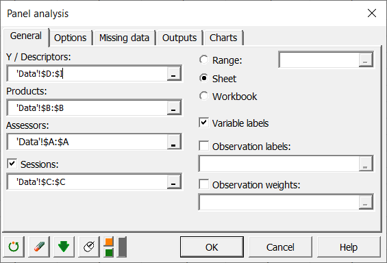
In the General tab, you can then select the Descriptors, Products and Assessors.
If you have several Sessions, check the relative option. 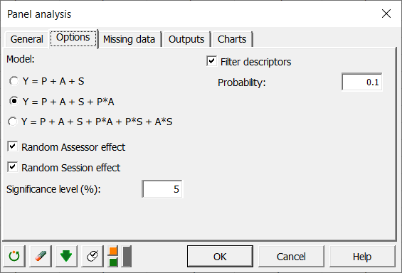
Several models are possible depending on whether you select a session, whether you want to include interactions in the model, and whether you consider assessors and sessions (repetition) as random or fixed effects. Random factors are considered as random variables with mean 0 and a given variance. This means that once the product effect is considered, the other effects are purely due to randomization. This is only valid if you can assume no structural difference between assessors or between sessions. These assumptions can be verified in the following analysis.
Interpreting the results of a sensory panel analysis in Excel using XLSTAT
As many charts are created it can take some time before you can move in the results sheet. We recommend that you do not click in Excel until the arrow cursor is back.
The first table corresponds to basic summary statistics for the various input variables. You can use the information of the minimum and maximum to make sure there are no absurd values for the descriptors.
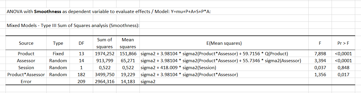
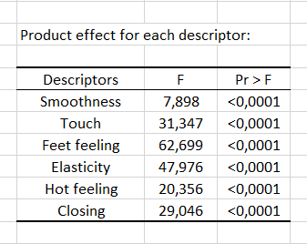
The first step of panel analysis consists of running an ANOVA on the whole dataset for each descriptor, in order to identify descriptors for which there is no product effect. For each descriptor, the table of Type III SS of the ANOVA is displayed for the selected model. If there is no product effect for a given descriptor (p-value > the probability defined in the Options tab), the latter one can be removed from the analysis if you check the Filter descriptors in the Options tab. Here is an example for the Smoothness attribute.
Then, a summary table allows comparing the p-values of the product effect for the different descriptors. The analysis which follows will only be conducted for the descriptors which allow discriminating the products. In our case, there is a product effect for all descriptors, so all the descriptors are taken into account in the next steps of the analysis.
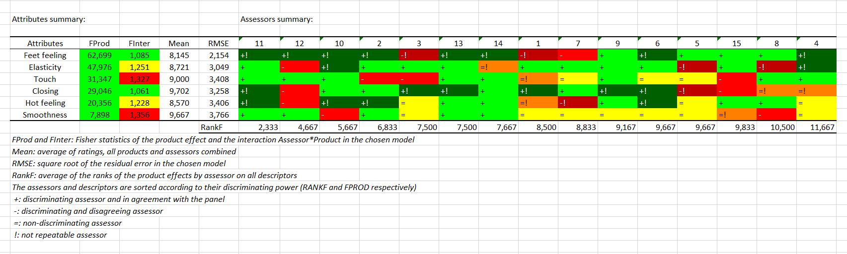
Then comes the CAP (Control of Assessor Performances) table. Note that this output is based on ANOVA calculations and is therefore only generated if each product has been seen at least 2 times, or in other words if the number of observations is greater than the number of judges multiplied by the number of products. The left part is a summary of the descriptors. They are sorted according to their product discrimination. If the p-value is less than 0.1, the color is yellow. If it is less than 0.05, the color is green. Otherwise, the color is red. It is exactly the opposite for product*assessor interaction since it is not a positive thing to have a significant interaction. The average of the attribute and the square root of the error are available in columns 3 and 4.
The right-hand side of the table refers to assessors. Warning, if a filter has been applied, this part will be displayed under the previous one. The assessors are sorted according to their average rank average of the effects produced individually on all descriptors. For a given descriptor, if an assessor does not discriminate the products, he or she will then have a "=". If he/she discriminates the products and agrees with the panel (test on his contribution to the subject*product interaction), he/she will have a "+". Otherwise a "-" is displayed. Finally, if the assessor has a session effect for the corresponding descriptor (drift-mood), or if he/she is significantly less reliable than other judges from one session to another, he/she is considered non-repeatable and will then have a "!"added.
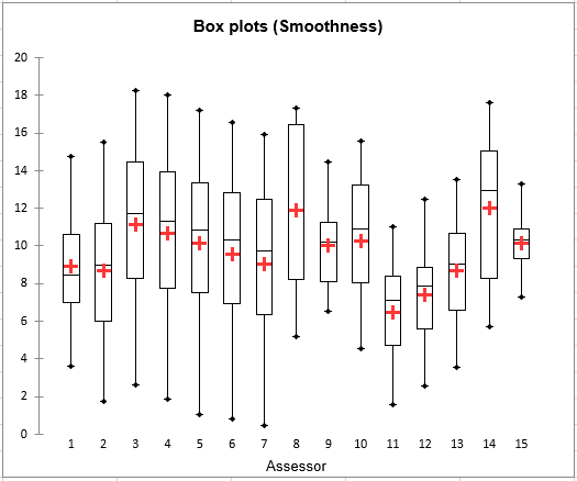
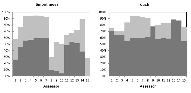
The second step includes a graphical analysis. For the 6 descriptors, box plots and strip plots are displayed. Thus we can see how, for each descriptor, different assessors use the rating scale to evaluate the different products. On the box plot for Smoothness assessors 9 and 15, while having a similar mean, use differently the rating scale. Assessors 3,4,5,6 and 7, while using similar ranges of rating tend to rate differently in terms of position. Of course, such plots do not reveal anything on the agreement between assessors: you could see a case where, while the box plots look very similar, the product corresponding to the minimum for an assessor (minimum and maximum values are displayed with blue dots on the box plots) might correspond to the maximum of the other assessor.
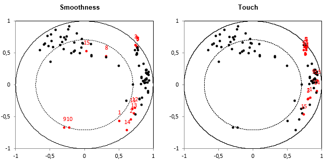
We now want to check whether the assessors agree for the different descriptors, and how the descriptors bring different rating possibilities (are they correlated or not?). The third step starts with restructuring the data table, in order to have a table containing one row per product and one column per pair of assessor and descriptor (if there are several sessions, the table contains averages ) followed by a PCA on this same table. The PCA is performed on standardized data.
The next chart corresponds to the same PCA correlation plot replicated for each descriptor, highlighting in red the dots the 15 (assessor, descriptor) pairs corresponding to the descriptor mentioned in the title. This allows checking in one step the extent to which assessors agree or not for all descriptors, once the effect of position and scale is removed (because the PCA is performed on standardized data).
The following chart gives for each pair of (assessor, descriptor) the % of variance carried by the PCA plot. In dark grey you can see the % carried by the first axis and in light grey the % of variance carried by the second axis. We see that for Smoothness, there are different groups of assessors, with assessors (8,9,10) that are more related to the second axis but still badly represented.
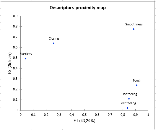
To study more precisely the relationship between descriptors, an MFA (Multiple Factor Analysis) plot of the descriptors is displayed. The MFA is based on a table in which there are as many subtables as there are descriptors. Each subtable contains the averages for each product (rows) by each assessor (columns).
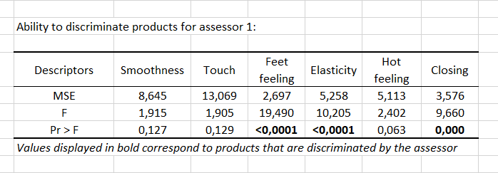
During the fourth step, an ANOVA is performed for each assessor, and for each of the 6 descriptors, to check whether there is a product effect, to evaluate for each assessor the discrimination ability. A table is displayed for each assessor to show if there is a product effect or not for the various descriptors. The p-values are displayed in bold if they are lower than the threshold defined in the Options tab. The p-values displayed in bold correspond to descriptors for which the assessor was able to differentiate the products.
An example is given below for assessor 1. We can see that assessor 1 was able to differentiate the products for Feet feeling, Elasticity and Closing attributes.
A summary table is then used to count for each assessor the number of descriptors for which he/she was able to differentiate the products. The corresponding percentage is computed. This percentage is a simple measure of the discriminating power of assessors. The percentages by assessor can be visualised on a bar chart.

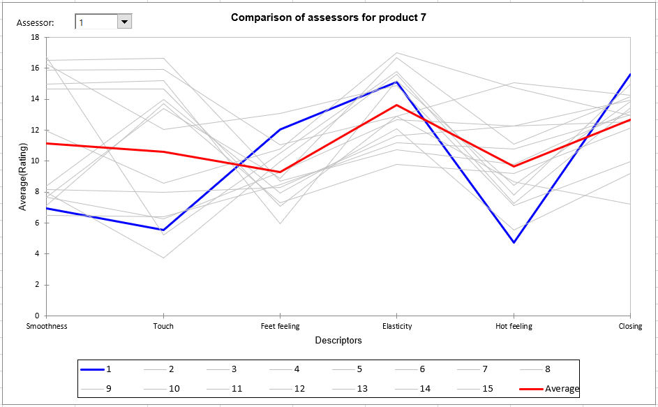
For the fifth step, a global table initially presents ratings (averaged over the sessions if available) for each assessor in rows, and each pair (product, descriptor) in columns. It is followed by a series of tables and charts to compare, product by product, assessors (averaged over the possible repetitions) for the set of descriptors. These charts can be used to identify strong trends and possible atypical ratings for some assessors. The red line corresponds to the average value over all assessors for the product of interest and the blue line the assessor selected in the list at the top left of the chart. In the example below we can see that assessor 1 rated product 7 below the average for Smoothness, Touch and Hot Feeling, and close to the average for the other descriptors.
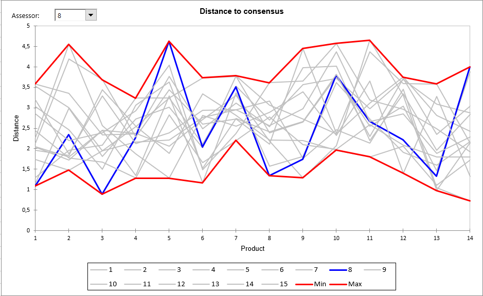
In the sixth step, we can identify atypical assessors through the measure for each product of the Euclidean distance of each assessor to an average for all assessors in the space of all the descriptors. A table showing these distances for each product and the minimum and maximum computed over all assessors, helps to identify assessors who are close to or far from the consensus. The following chart visualizes these distances. The lower the distance, the closer the assessor to the consensus (the centroid). Value 0 corresponds to the average over all assessors. If for a given product, all assessors give the same rating for all descriptors, the Min and Max would be 0 for that product. If an assessor gives a value equal to the average obtained over the other descriptors, we would have the minimum equal to zero for that product In the example below, we see that assessor 8 does not agree with the other assessors for products 5 and 14. On the other hand, there is an agreement for products 1, 3 and 8, where the distance to consensus is smaller.
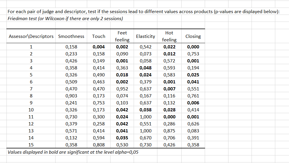
As a Session variable was selected, the seventh step verifies if for some assessors there is a session effect, typically an order effect. This is assessed using a Wilcoxon signed rank test as there are only two sessions (in the case of 3 or more sessions, a Friedman test is used). The test is calculated on all products, descriptor by descriptor. We can see in the table below that for 4 descriptors out of 6, there is a session effect for assessor 1. We can also see that for Feet feeling there is a session effect for 9 assessors out of 15.
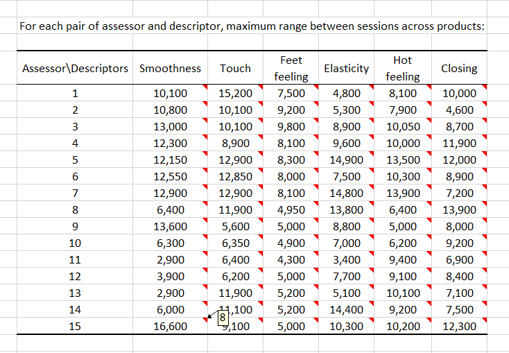
Then, for each assessor and each descriptor, we calculate which is the maximum observed range between sessions across products. You can see the product that corresponds to the maximum range by leaving the mouse over the red triangle that is displayed in each cell. For example, there is a high range for assessor 15 on Smoothness which corresponds to product 8. Most pairs of (assessor, descriptor), here, have high ranges. This makes the validity of this survey questionable.
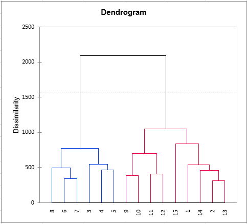
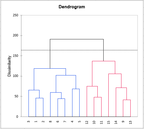
As for each triple (assessor, product, descriptor) there exists at least one rating, the eighth step consists of clustering the assessors. The clustering is first performed on the raw data, then on the standardized data to eliminate possible effects of scale and position.
Finally, a pre-formatted table to use the STATIS method is present. This method will provide you indications of agreements between assessors and more generally between an assessor and the panel's overall point of view. Moreover, a map of the products will be produced.
Was this article useful?
- Yes
- No