CATA Check-All-That-Apply analysis tutorial in Excel tutorial
This tutorial will help you set up and interpret a CATA analysis in Excel using the XLSTAT statistical software.
Dataset for running a CATA analysis in XLSTAT
For this tutorial, we use data provided by Ares et al. (2014). They correspond to the assessment of 6 products (5 regular and 1 ideal) by 119 consumers over 15 attributes. Data is recorded in a binary format (0: attribute not checked; 1: attribute checked). Moreover, every product (except the ideal one) is rated overall (0-10) by each consumer.
Data is in a vertical format, which means that we have one row per combination of consumer and product.
Goal of this tutorial
This tutorial aims to conduct a CATA (Check-All-That-Apply) analysis to characterize products tested by consumers.
Setting up a CATA analysis in XLSTAT
-
To conduct a CATA analysis, click on Sensory / CATA data / CATA data analysis.
-
In the General tab, first make sure you select the Vertical data format.
-
In the CATA data field, select the attribute table.
-
Then select the Consumer, Sample and liking columns in the Assessors, Products and Preference data fields, respectively.
-
Capture the ideal product identifier in the Ideal product field.
Important: The dataset must be balanced (One assessor for each product).

In the Options(1) tab, select the Chi-square distance for the Correspondence Analysis, CATA data validation and Independence of attributes.
-
Click the OK button.
-
A dialogue box appears to select and validate the axes to be displayed on the graphical representation of the correspondence analysis, just click the Done button.
Interpreting the results of a CATA analysis in XLSTAT - First part
The first two tables and graphs relate to the validation of CATA data. First of all, a detection of the assessors who checked much more or less than the others is performed. In our case, most of the judges checked between 20% and 35% of the time, but some of them have a particular behaviour. For example, assessor 27 checked only 7% of the time! A similar attribute analysis is then performed to detect over- or under-used attributes.

Then, an analysis combining the two previous ones is carried out. It indicates the percentage of checks per assessor and per attribute. This analysis makes it possible to determine if the attributes are checked in a consensual way or not. The Juicy attribute is subject to contrasts, with some assessors checking it more than 80% of the time and others less than 20%.

For a given attribute, Cochran’s Q test allows to testing of the effect of an explanatory variable (Products) on whether the consumers feel the attribute or not. A low p-value beyond a significance threshold indicates that products significantly differ from each other. If the p-value is significant, the user may be interested in examining multiple pairwise comparisons, represented by small letters inside table cells:
-
two products sharing the same letter(s) do not differ significantly.
-
two products having no letter in common differ significantly.
We can see that all of the attributes except two related to smelling (odourless and intense odour) are associated to significant p-values at 0.05. For example, if we consider the crispy attribute, product 257 is the most checked. However, it is not significantly crispier than the 548 (check the letters). Products 992 and 366 are the least crispy and do not differ significantly from each other.


For each of the products, an attribute independence test is performed to determine if these attributes are not redundant. Thus, we can see that for product 106, the attributes Juicy and Firm are redundant.

The following contingency table is the sum of attribute tables across assessors. It is used to construct a correspondence analysis (CA).
The independence between the rows and columns is tested (this result is currently only available for the classic CA (using the Chi-square distance)). As the p-value is lower than the significance level (0.05) we conclude that it is very likely that real differences exist between the products in terms of their sensory profiles.
The table of the eigenvalues and the corresponding plot allow to verify the quality of the analysis. The quality of the analysis is good (92.17% of explained total inertia on the first two dimensions).
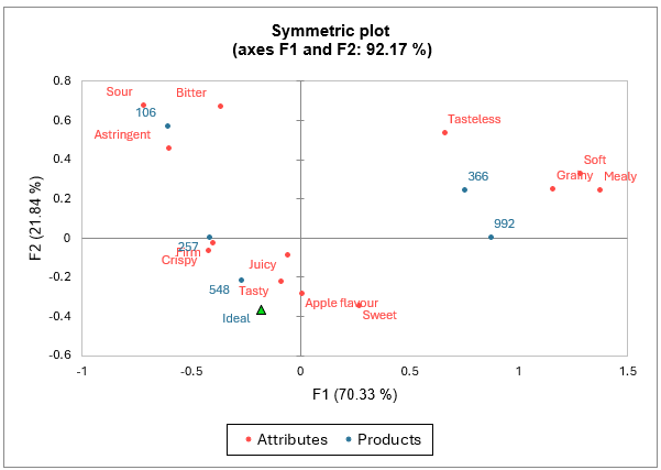
According to the map of the analysis, an ideal product should be relatively tasty, juicy, crispy, firm and sweet and have an apple flavour.
On the other hand, it should not be relatively too sour, bitter, astringent, grainy, soft, mealy, or tasteless. Product 548 seems to be the closest to the ideal product whereas product 106 is far away because of its relative bitterness, sourness and astringency. Products 366 and 992 are also relatively far from the ideal product.
More information about correspondence analysis is available here.
Then, a correlation matrix including attributes (tetrachoric correlation) and liking scores (biserial correlation, last row) is displayed. We see some strong correlations. The negative correlation between sweet and sour indicates that when people tick sour, they do not tick sweet, and vice versa. Liking scores seem to be positively –although weakly- correlated to attributes that were linked to the ideal product in the correspondence analysis (juicy, tasty, apple flavour).

Principal Coordinates Analysis (PCoA) is applied to the correlation coefficients and results are visualized in a two dimensional map. The scree plot indicates that the two first dimensions are sufficient to interpret relationships between attributes. Here again, we see that liking is associated to the attributes juicy, tasty and apple flavour.
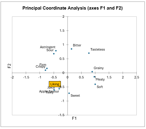
More information about principal coordinate analysis is available here.
Interpreting the results of a CATA analysis in XLSTAT - Second part
When liking data is available, the next results are related to the penalty analysis.
A first analysis based on incongruence in which the attribute is missing in the real but not the ideal product allows to identify the must-have attributes. A summary table indicates the frequencies with which P(No)|(Yes) and P(Yes)|(Yes) occur for each attribute. The graphical representation that follows shows these frequencies as well as the percentage of records for these occurrences.

Mean drops in liking between the two situations are then presented for each attribute and their significances tested. For example, the firm attribute implies an increase of 1.5 Liking points between the tested products and the ideal product. This increase is significant at 0.05 (p < 0.0001).
Note: In the case where there is no ideal product, this analysis is substituted by an analysis of presence and absence of the attributes.

The mean impact chart shows the attributes with a significant mean impact. Mean increases are displayed in blue and are identified as “must-have”, mean decreases are displayed in red.

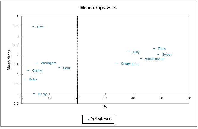
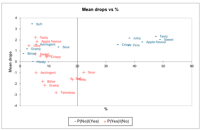
The mean drops vs % chart also allow to clearly identify the “must have” attributes.
-
The Y-axis corresponds to the differences in product appreciation when consumers check both a product and the ideal product (cell [1,1] of the "attribute analysis" table) and when they check only the ideal product (cell [0,1]).
-
The X-axis represents the percentage of entries including a check for the ideal product without the actual product being checked. This corresponds to a situation where the attribute describes the ideal product well but is relatively little felt in the actual products.
Therefore, attributes that are associated to high coordinates on both the X and Y axes (tasty, sweet, juicy, apple flavour, crispy, firm) appear here again to be “must have”.
A second analysis allow to identify the “nice to have” attributes. It is similar to the first one but is based on incongruence in which the attribute is missing in the ideal but not the real product.
Note: This analysis is only available when an ideal product is available.
The mean impact chart shows the attributes with a significant mean impact. Mean increases are displayed in blue and are identified as “nice to have”, mean decreases are displayed in red and are identified as must not have. Here, only the attribute Sour could be analyzed.

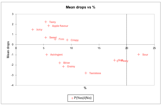
The mean drops vs % chart also allows to clearly identify **“must not have” and “nice to have” attributes.
-
The Y-axis corresponds to the differences in product appreciation when consumers did not check either the ideal product or the product (cell [0.0] in the "Attribute Analysis" table) and when they checked the product (cell [1.0]).
-
The X-axis represents the percentage of inputs including a check for the real product without the ideal product being checked, which corresponds to a situation where the attribute describes the real products well but is relatively unchecked for the ideal product.
Therefore, attributes that are associated to low coordinate on the Y axis (astringent, bitter, grainy, tasteless, soft, mealy, sour) appear here again to be “must not have”. Attributes associated to high coordinates on the Y axis are “nice to have”.
The two previous analyses are finally summarized in one map. Here again, tasty, sweet, apple flavour, firm, crispy and juicy appear as “must have“; and sour appears as “must not have”.
Then, one 2x2 table is displayed per attribute. On the left of each table, we have the values recorded for the ideal product and at the top, the values obtained for the surveyed products. In the cells of the tables, we can find the average preference (averaged over the assessors and the products) and the % of all records that correspond to this combination of 0s and/or 1s.
For a given attribute, if it has been checked for the ideal product (second line of the table) and if the preference for the checked products (cell [1,1]) is significantly higher than the preference for the unchecked products (cell [1,0]), then the attribute is a must have.
On the other hand, if the attribute is not checked for the ideal product (first line of the table) and if the preference for the unchecked products (cell [0,0]) is significantly higher than the preference for the checked products (cell [0,1]), then the attribute is a must not have.
If (cell [0,1]) > (cell [0,0]) significantly, then the attribute is nice to have. If the attribute is unchecked for the ideal product (first line of the table), that it’s neither a must not have nor a nice to have, and if the preference for the checked products (cell [0,1]) is comparable to the preference for the unchecked product (cell [0,0]), then the attribute does not harm.
XLSTAT considers two products being comparable if the absolute value of their difference is below 1. Finally, if the attribute is not a must have and that the preference for the checked products (cell [1,1]) is comparable to the preference fo the unchecked products (cell [1,0]), the attribute does not influence.
Some tables can correspond to the 3 situations.
XLSTAT will try to associate each 2x2 table to a single situation by linking it to one of the above rules, respecting this order.
Please note that to take a decision regarding an attribute, XLSTAT will check that the chosen threshold for population Size (Options 2 tab from the dialog box) is respected. For example, for the Firm attribute, 41% of the surveyed (not ideal) product records are checked for both the surveyed product and the ideal product. The average liking of these records is 7.1.

In the final summary table, we can see that 6 out of the 15 attributes are “must have”, 1 is a does not harm and 1 attribute is a must not have. The remaining attributes could not be related to any category.

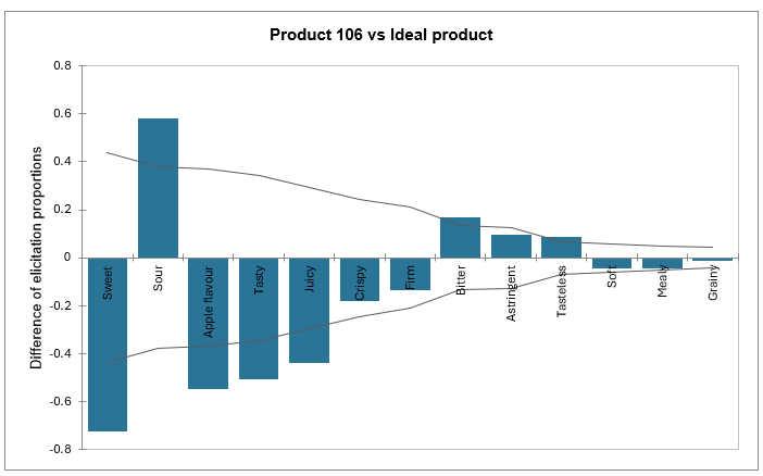
Finally, you can see a graphical representation of elicitation difference for each product compared to the ideal. For each attribute, we can see whether the product is similar or different from the ideal product. The more differences an attribute is subject to, the more problematic it is and will be located on the left side of the graph. Conversely, the more for a given attribute the product is similar to the ideal product, the closer the line will be to 0. If the difference is negative, the attribute is not present enough, while if it is positive, it is too present.
The confidence interval is used to determine if the difference with the ideal product is significant.
In the example of the tutorial, the value represented by the first bar in the graph 'Product 106 vs Ideal product' can be computed as follows:
(6/119) – 92/119) = 0,0504 – 0,7731 = -0,7227.
Going further
Discover another method to analyze CATA datasets available in XLSTAT: CATATIS. To classify consumers with CATA data, please use the CLUSCATA method.
Was this article useful?
- Yes
- No