Analysis of CATA data with CATATIS in Excel
This tutorial shows how to compute and interpret a CATATIS analysis in Excel using the XLSTAT software.
Dataset for a CATATIS analysis
The data used to illustrate the CATATIS method relate to a Check-All-That-Apply (CATA) experiment where 76 consumers evaluated 9 images of beer using 15 attributes. Consumers were asked to check the relevant contexts of use for drinking each beer. Attributes give distinct contexts for drinking beer such as watching TV at home, At a public house or To serve to guests. These data are precisely described in Giacalone, D., Frøst, M. B., Bredie, W. L., Pineau, B., Hunter, D. C., Paisley, A. G. & Jaeger, S. R. (2015). Situational appropriateness of beer is influenced by product familiarity*. Food Quality and Preference*, 39, 16-27.
Goal of this tutorial
The aim here is to study two characteristics of CATA data:
- the links between products and attributes, i.e. beers and contexts.
- the agreements between consumers, individually and globally.
For this purpose, we will use the CATATIS function of XLSTAT. This tool will allow us to visualize the links between products and attributes, as well as calculate similarity indices between consumers.
Setting up a CATATIS analysis in XLSTAT
Select the XLSTAT / Advanced features/ Sensory data analysis/ CATATIS Command (see below).
The CATATIS dialog box appears.
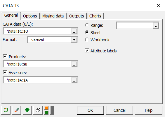 In the General tab, you can then select the CATA data (all your merged data). The Format indicates how you have merged your data, horizontally or vertically. If the Format is horizontal, you must indicate the number of assessors, and if it is vertical, Products and Assessors are mandatory.
Here our data are merged vertically, and we therefore select the Products and Assessors. Moreover, we have labels for attributes, so we check the Attribute labels box to indicate it to XLSTAT.
In the Charts tab, if you select the Display charts on two axes box, you will automatically have the representation on the first 2 factorial axes. If you uncheck it, a window will open and you will be able to choose your axes.
Interpreting the results of a CATATIS analysis in Excel using XLSTAT
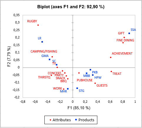
One of the most important results of CATATIS is the graphical representation of products and attributes. On the following graph we can see on the one hand that we have 92.90% inertia reported by our first two axes, so we can be satisfied with these two. The graph shows a contrast between the contexts that require celebration (fine dining, achievement...) and the casual contexts (fishing, rugby...). LR beer is therefore rather seen as a casual beer while the SSA is seen as a celebration beer.
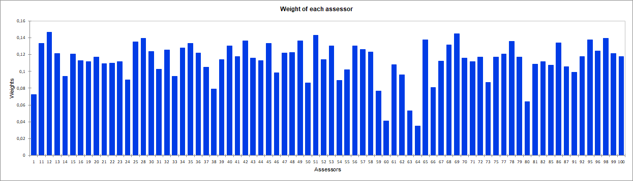
Another important result is the weight given by CATATIS to each assessor. Indeed, the lower the weight of a judge, the more atypical his point of view is. For example, here the subjects 60 and 64 are very atypical.
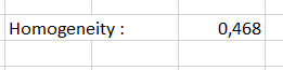
Finally, homogeneity is a global indicator (between 1/number of assessors and 1) of agreement between consumers. Here it is 0.468, which is correct but shows differences in points of view between consumers.
Was this article useful?
- Yes
- No