Clustering subjects in a CATA task by means of CLUSCATA
This tutorial shows how to compute and interpret a clustering of subjects in a CATA task by means of CLUSCATA in Excel using the XLSTAT software.
Dataset for running the CLUSCATA method
The data used to illustrate the CLUSCATA method refer to a Check-All-That-Apply (CATA) experiment where 114 consumers evaluated 6 strawberries using 16 attributes (Ares & Jaeger, 2013). Consumers were asked to check which of the proposed attributes applied to describe each of the strawberries.
Goal of this tutorial
The aim here is to perform a three-step data analysis:
- Segment the subjects according to their perceptions of the products. The CLUSCATA method will be used to create the most homogeneous classes possible.
- Analyse each class of subjects using the CATATIS method in order to determine the differences in perceptions of strawberries between classes.
- Determine clustering quality indices.
We will use the CLUSCATA feature to do this analysis. This tool will allow us to achieve the three objectives defined above.
Setting up a CLUSCATA analysis in XLSTAT
Select the XLSTAT / Advanced features/ Sensory data analysis/ CLUSCATA feature.
The CLUSCATA dialog box appears.
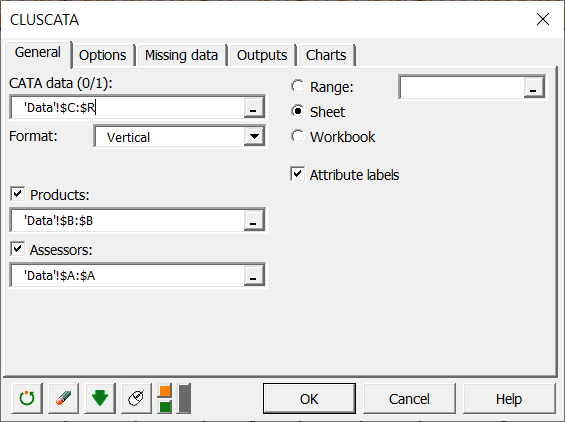
In the General tab, select the CATA data (all your merged data). The Format indicates how you've merged your data, horizontally or vertically. If the Format is horizontal, you must indicate the number of assessors, and if it is vertical, Products and Assessors are mandatory.
Here our data are merged vertically, and we therefore select the Products and Assessors. Moreover, we have labels for attributes, so we check the Attribute labels box to indicate it to XLSTAT.
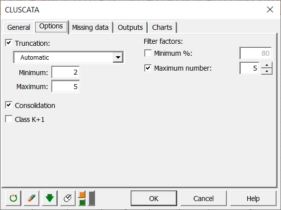
In the Options tab, we decided to leave the choice of the number of classes automatic, and to apply a consolidation of the classes obtained by the hierarchical algorithm in order to obtain a more precise cluster analysis.
In the Charts tab, if you select the Display charts on the first two axes box, you will automatically have the representation on the first 2 factorial axes of the different maps. If you uncheck it, a window will open, and you will be able to choose your axes.
Interpreting the results of a CLUSCATA analysis with XLSTAT
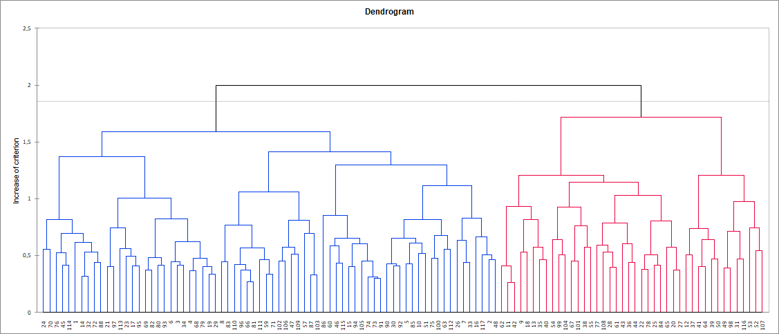
The chart below is the dendrogram. It represents how the algorithm works to group the subjects. As you can see, the algorithm has successfully grouped all the subjects. The dotted line represents the automatic truncation, leading to two classes.
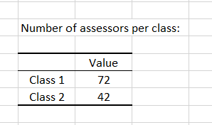
Three tables follow, giving the results by groups per subject, per class and the number of subjects in each class. We can see here that class 1 contains many more subjects than class 2.
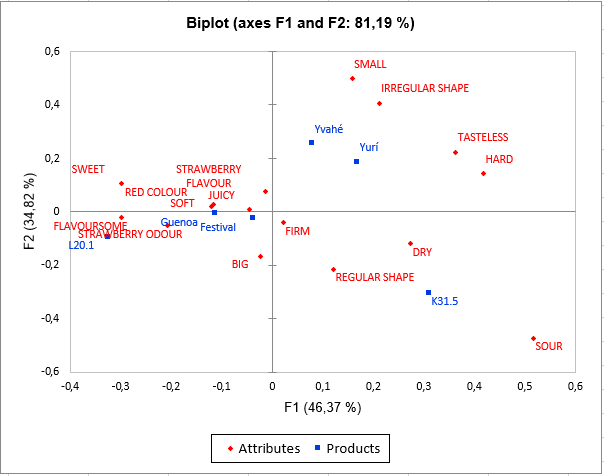
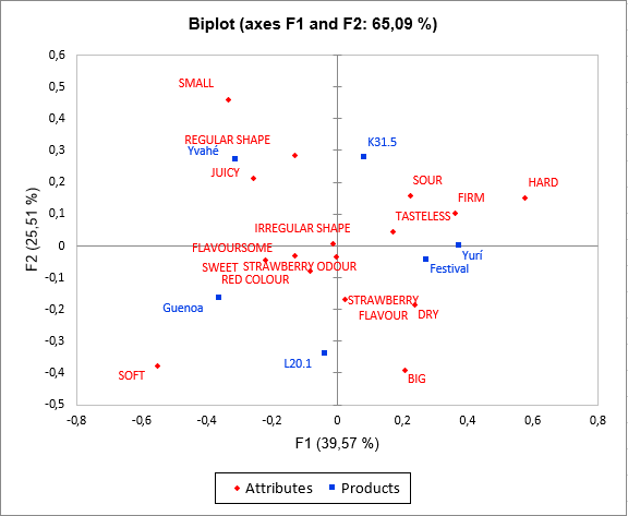
Then comes the analysis of each of the classes built. The representation of the products and attributes in each class highlights differences in perception between the classes of subjects. Indeed, Yvahé and Yurí strawberries are placed together in class 1 and are considered different in class 2. We can also note that the Yvahé strawberry is considered rather irregular in shape in class 1 and regular in shape in class 2.
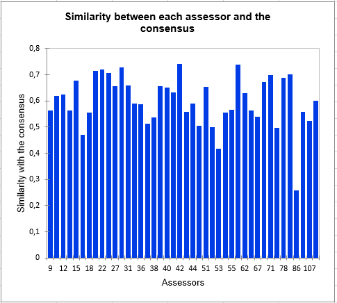
The following graph gives indications on the proximity of the subjects and the consensus table of the class in which they are placed. These proximities are represented by the Ochiai similarity coefficient s, which is a similarity index between 0 and 1. In class 2, we can observe that subject 86 is much further from the consensus than the others, which means that it does not conform well to the class. His perception is different from the two classes (since he has been placed in the class that most correspond him by the algorithm). This kind of problem can be solved by adding the class "K+1" in the Options tab, which is an additional class designed to set aside atypical subjects. In a CATA task, it is very frequent to put aside a large part of the subjects with the class "K+1". This is due to the fact that the subjects often give very different results.
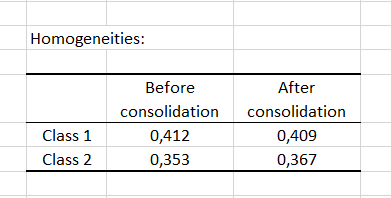
Finally, the homogeneity index of each class allows to assess the quality of the cluster analysis. The closer these indices are to 1, the more homogeneous the classes are. Here we see that class 1 is more homogeneous than class 2. This homogeneity could be improved with the addition of a class "K+1".
Was this article useful?
- Yes
- No