Run Generalized Procrustes Analysis (GPA) in Excel
This tutorial will show you how to run and interpret a Generalized Procrustes Analysis - GPA - in Excel using the XLSTAT statistical software.
What is Generalized Procrustes Analysis?
Generalized Procrustes Analysis (GPA), a method that is used in several domains, is used in sensory analysis before a Preference Mapping to reduce the scale effects and to obtain a consensus configuration. It also allows comparing the proximity between the terms that are used by different experts to describe products.
Dataset for Generalized Procrustes Analysis
The data used in this tutorial correspond to a study where a product marketing team wants to determine how four slightly different cheeses are evaluated. Ten experts have been asked to rate the four cheeses several times (without knowing which is which), using three criteria: acidity, strangeness, hardness.
The values used here correspond to the average rating for each cheese and each expert.
Goal of this Generalized Procrustes Analysis
Our goal is to transform the data to remove scaling effects (some experts might use a wider scale) or position effects (some experts might tend to use more the lower or the higher part of the rating scales), to obtain a consensus configuration that will then be used in an external preference mapping.
Setting up a Generalized Procrustes Analysis
To activate the Generalized Procrustes Analysis dialog box, start XLSTAT, and select the Sensory data analysis / Generalized Procrustes Analysis or Multiblock data analysis / Generalized Procrustes Analysis command.
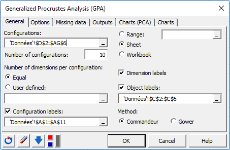
Once you have clicked on the button, the dialog box appears. Then, select the data that corresponds the configurations (a configuration corresponds here to the set of rates given by an expert).
The number of configurations must be entered. As we have 10 experts, we enter 10.
As each expert gave rates for each of the three dimensions, we can let XLSTAT know that the number of dimensions is constant by selecting the Equal option.
When the number of dimensions is different for a least one configuration, you need to select a column that contains the number of dimensions for each configuration.
So that the results look better we also select the configurations labels and the objects labels (in our case the cheeses).
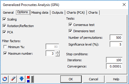
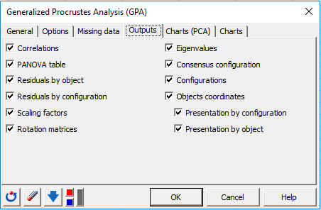
The following options have been selected.
After you have clicked on the OK button, the computations start and the results are displayed on a new Excel sheet.
Interpreting the results of a Generalized Procrustes Analysis
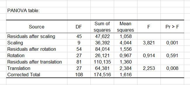
The first result is the PANOVA table that summarizes the efficiency of each Generalized Procrustes Analysis transformation in terms of reduction of the total variability. We can see that the Scaling transformation is the most efficient (lowest p-value).
The second table and the corresponding chart give the residuals by object after the transformations. We can see that the C3 cheese has the smallest residual. This indicates that there is most probably a consensus between experts.

The third table and the corresponding chart give the residuals by configuration after the transformations. We can see that the Expert2 has the highest residual, which means that he gave rates that do not match the consensus.

The next table and chart give scaling factors of the Generalized Procrustes Analysis transformations. A factor lower than 1 indicates that the corresponding expert was using a wider scale than the others. A factor higher than 1 indicates that the corresponding expert was not using the rating scale as widely as the other experts. We can see that here that the experts 1 and 3 tend to use a narrower scale than the other experts.

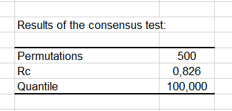
A consensus test is then performed to check if the consensus configuration is a true consensus. This permutation test allows determining whether the observed Rc value (Rc corresponds to the proportion of the original variance explained by the consensus configuration) is significantly higher than 95% of the results that are obtained when permuting the data.

Another permutation test is used to verify how many dimensions should be retained to display the results. We see here that for the third dimension, the F value is below the 95th percentile. So we can conclude that two dimensions are enough.

The next results correspond to the results of the PCA step (unstandardized PCA). While the Generalized Procrustes Analysis already includes a rotation step for each configuration, so that it matches the consensus configuration, the PCA corresponds here to the optimal transformation of the consensus configuration under the usual PCA constraints. The PCA transformation is then applied to each configuration corresponding to each expert.
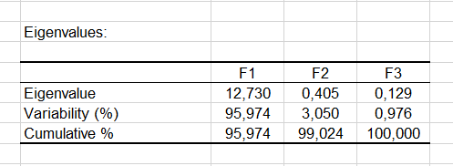
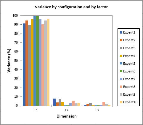
The eigenvalues show how much of the variability corresponds to each axis. We see that here we have 99% of the variability represented on the first two axes. When the variability is split between the experts we see that the results are almost identical for all experts.
The results are then separated into the results corresponding to the consensus configuration, and the results for each individual configuration. The objects coordinates of the consensus configuration could be used later in a PREFMAP analysis as the coordinates of the products on the preference map.
On the correlation circle we can see that the "Strangeness" is most of the time on the negative side of the first axis, and that Acidity and Hardness are often mixed. The Strangeness at the origin of the plot corresponds to the 6th expert that did not rate the products on that criterion.

The next two charts are the maps of the objects, respectively colored by configuration and by object (see below). The points are all close to the first axis because 96% of the variability is concentrated on the frist axis, and because XLSTAT displays orthonormal maps to avoid misleading interpretations.

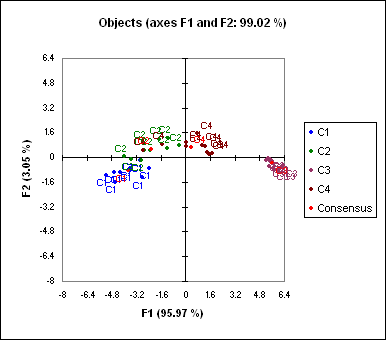
In order to make the chart more legible, we change the scale options (as you can do with any Excel chart - you can also do that with the XLSTAT AxesZoomer). We obtain the following map:

We can see that the cheeses C1 and C3 are clearly separated on the map, while the border between products C2 and C4 is not as clear. That means that the experts differentiate well C1 and C3 and there is a consensus on these products, and that they do not distinguish as well C2 and C4.Principal component analysis (PCA) in Excel
Was this article useful?
- Yes
- No