Penalty analysis in Excel tutorial
This tutorial helps you set up and interpret a penalty analysis in Excel using the XLSTAT statistical software.
Dataset to run a penalty analysis
Two types of data are used in this example:
-
Preference data (or liking scores) that example corresponds to a survey where a given brand/type of potato chips has been evaluated by 150 consumers. Each consumer gave a rating on a 1 to 5 scale for four attributes (Saltiness, Sweetness, Acidity, Crunchiness) - 1 means "little", and 5 "a lot" -, and then gave an overall liking score on a 1-10 Likert scale.
-
Data was collected on a JAR (Just About Right) 5-point scale. These correspond to ratings ranging from 1 to 5 for four attributes (Saltiness, Sweetness, Acidity, Crunchiness). 1 corresponds not «’ Not enough at all», 2 to «’ Not enough’», 3 to «’ JAR’»’ (Just About Right), an ideal for the consumer, 4 to «’ Too much’» and 5 to «’ Far too much».
Goal of this tutorial
Our goal is to identify some possible directions for the development of a new product.
Setting up a penalty analysis
-
Once XLSTAT is open, click on Sensory / Rapid Tasks / Penalty analysis.
-
The Penalty analysis dialog box appears.
-
We select the liking scores, and then the JAR data. The 3 levels JAR labels are also selected. They make the results easier to interpret.

-
In the Options tab, we define the threshold of the sample size below which the comparison tests won't be performed because they might not be reliable enough.
-
In the Outputs, the Spearman correlation was chosen because the data are ordinal.
-
The computations begin once you have clicked OK. The results will then be displayed.
Interpreting the results of a penalty analysis
The first results are the descriptive statistics for the liking data and the various JAR variables. The correlation matrix is then displayed.

The correlations between the liking and JAR variables should not be interpreted as the ranks of the JAR data are not true ordinal data (5 is less than 3 on the JAR scale, while 5 is more than 3 on the liking scale).
However, if a correlation between a JAR variable and a liking variable is significantly different from 0, which could mean that the JAR variable has a low impact on the liking: if it had a strong impact, the correlation should ideally be 0. If the "too much" cases have a lower impact than the "too little", the correlation might be positive, and vice-versa for the negative correlations.
The next table is a summary of the JAR data. The chart that follows is based on that table and allows visualizing quickly how the JAR scores are distributed for each dimension.

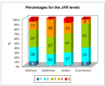
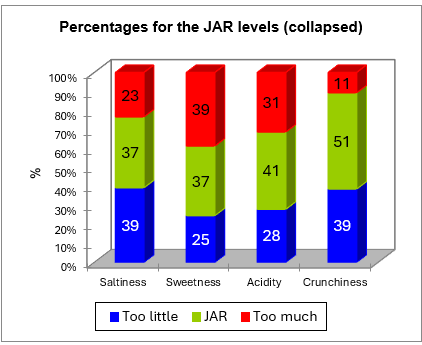
The data are then aggregated into a 3 levels scale. The corresponding frequencies table and chart are displayed below.

The next table corresponds to the penalty analysis.

The following information is displayed for each JAR dimension:
-
The name of the JAR dimension.
-
The 3 collapsed levels of the JAR data.
-
The frequencies corresponding to each level.
-
The % corresponding to each level.
-
The sum of the liking scores corresponding to each level.
-
The average liking for each level.
-
The mean drops for the "too much" and "too little" levels (this is the difference between the liking mean for the JAR levels minus the "too much" or "too little" levels. This information is interesting as it shows how many points of liking you lose for having a product "too much" or "too little" for a consumer.
-
The standardized differences are intermediate statistics that are then used for the comparison tests.
-
The p-values correspond to the comparison test of the mean for the JAR level and the means for the two other levels (this is a multiple comparison with 3 groups).
-
An interpretation is then automatically provided and depends on the selected significance level (here 5%).
-
The penalty is then computed. It is a weighted difference between the means (Mean of Liking for JAR - Mean of Liking for the two other levels taken together). This statistic has given its name to the method. It shows how many points of liking you lose for not being as expected by the consumer.
-
The standardized difference is an intermediate statistic that is then used for the comparison test.
-
The p-value corresponds to the comparison test of the mean for the JAR level with the mean of the other levels. This is equivalent to testing if the penalty is significantly different from 0 or not.
-
An interpretation is then automatically provided and depends on the selected significance level (here 5%).
For the saltiness dimension, we see that the customers strongly penalize the product when they consider it not salty enough. Both mean drops are significantly different from 0, and so is the overall penalty.
For the sweetness dimension, none of the tests is significant.
For the acidity dimension, the overall penalty is slightly significant, although the two mean drops are not. This means that acidity does matter for the customers, but this survey may not have been powerful enough to detect which specific mean drop (not enough acid and/or too acid) is concerned.
For the crunchiness, the mean drops test could not be computed for the "too much" level because the % of cases in this level is lower than the 20% threshold set earlier. When the product is not crunchy enough, the product is highly penalized.
The next two charts summarize the results described above. When a bar is red it means the difference is significant, when it is green, the difference is not significant, and when it is grey, the test was not computed because there were not enough cases.


Was this article useful?
- Yes
- No