Factorial analysis of mixed data (PCAmix) in Excel
This tutorial will help you set up and interpret a Factorial Analysis of mixed data in Excel using the XLSTAT software.
Dataset to run a Factorial Analysis of mixed data (PCAmix)
This dataset is an extract of data collected by Centre de recherche INRA d’Angers, France. Experts have been asked to rate 21 wines according to different sensorial descriptors (14 quantitative variables). We also have two qualitative variables about the wine origin and the nature of the soil.
What is the PCAmix method?
Use Factorial analysis of mixed data (PCAmix) to analyze a data table where observations are described both by quantitative variables and qualitative variables. This method is used to:
- Study and visualize correlations between variables.
- Obtain non-correlated factors which are linear combinations of the initial variables.
- Visualize observations in a 2- or 3-dimensional space.
The factorial analysis of mixed data is a method initially developed by Hill and Smith (1972). Few variants of this method have been developed since then (Escofier 1979, Pagès 2004). The method used in XLSTAT is called PCAmix and was developed by Chavent et al (2014). This method can be seen as a mixture of two well-known methods of factorial analysis: principal component analysis (PCA) which allows to study an observations/quantitative variables table and the multiple correspondence analysis (MCA) which allows to study an observations/qualitative variables table.
The PCAmix method can be seen as a mixture of these two methods, it allows the analysis of a table where n observations are described by both quantitative variables and qualitative variables. As the other factorial analysis methods, the PCAmix method aims to reduce data dimensionality as well as to identify nearness between variables but also proximity between the observations.
Setting up a Multiple Correspondence Analysis with XLSTAT
After opening XLSTAT, select the XLSTAT / Analyzing data / PCAmix command (see below).
Once you've clicked on the button, the PCAmix dialog box appears.
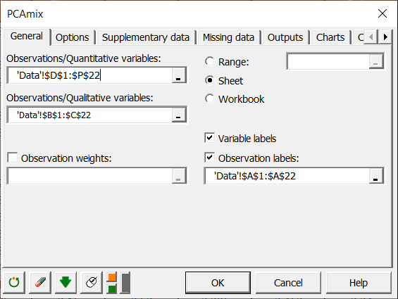
Select columns D-P in the Observations/quantitative variables field and columns B-C in the Observations/qualitative variables field. The Variable labels option is left activated as the first row of the table contains the name of the variables. Then select column A in the Observations labels field. 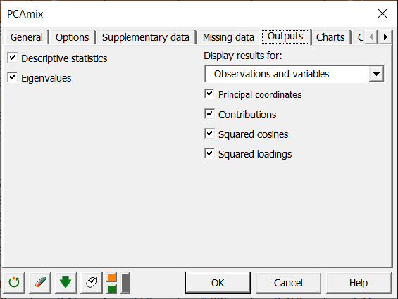
We choose to display all available results for variables and observations.
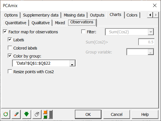
In the Charts/Observations tab, we choose to color observations according to a group variable which is simply a recoding of the quantitative variable “Global quality”. This coloration will allow us to distinguish groups of observations. All other options are left by default.
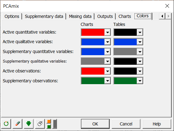
The Colors tab allows to define the colors used for the display of the results.
Interpreting PCAmix results
The first result displayed is the descriptive statistics of selected variables.
In the following table non-null eigenvalues and the corresponding percentage of inertia are displayed: 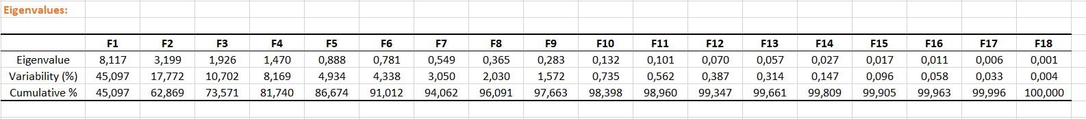
Then coordinates of quantitative variables and categories of qualitative variables on factorial axes are displayed followed by squared cosines, contributions and squared loadings. Same results are displayed for observations. Before interpreting proximity between two variables and/or observations, one should check that their contribution or their squared cosines are high on the considered axes.
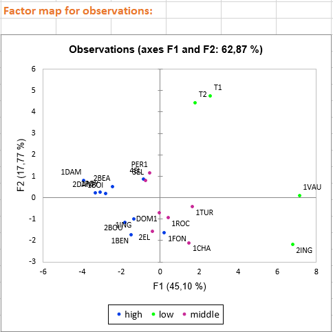
The following charts are very useful to interpret relationships between variables, observations and factorial axes: 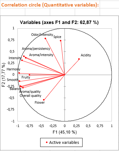
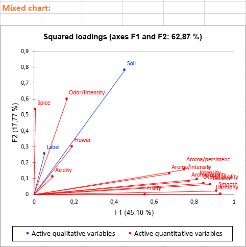
The three first charts visualize the links between variables and factorial axes. These charts allow us to give an interpretation in terms of factorial axes. For example: - Axis 1 is highly negatively correlated with the following variables: Fruity, Flower, Aroma/intensity, Aroma/persistency, Aroma/quality, Balance, Smooth, Intensity, Harmony, Overall quality. This means that wines having negative values on the first axis are wines with high values on these variables.
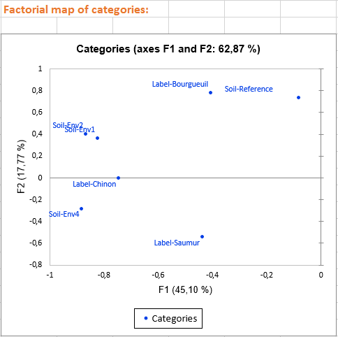
- Axis 2 is positively correlated with variables Odor/Intensity and Spice and negatively correlated with the Flower variable. This means that a wine with a high value on the second axis is a wine with a high ranking on Odor/intensity and Spice but with a low value on Flower. We also see that the qualitative variable Soil is linked with the second axis, for example, wines having the category Env4 are wines with high values on the second axis.
Based on the axes interpretation and the position of the wines on the last chart, we can detect the wine characteristics. Furthermore, the color of the observations allows us to distinguish the three wine groups according to their global quality. We see that the best wines (in blue) are wines with negative values on the first axis and low values on the secondary axis. Middle wines are close to the centre of the chart and less appreciated wines (in green) are those with high values either on the first axis (T1, T2) or the secondary axis (1VAU,2ING). For example, we may suggest that spicy wines are less appreciated.
Going further: Running an Agglomerative Hierarchical Clustering (AHC) after a PCAmix
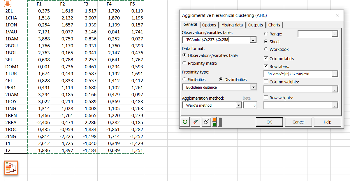
You can also launch an AHC by clicking on the button below the table of principal coordinates. An orange arrow allows you to go directly to the end of the table if it contains many variables. 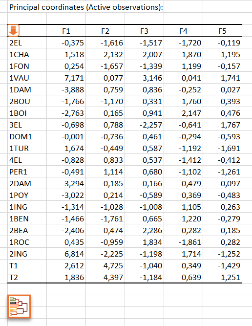
By clicking on this button, the AHC dialog box is then automatically configured and you just have to click on the OK button to launch the analysis.
Click here to see how to interpret the results of the AHC analysis.
Was this article useful?
- Yes
- No