Run a PCA with supplementary variables and observations
This tutorial will help you set up and interpret a Principal Component Analysis (PCA) with supplementary variables and individuals in Excel using the XLSTAT software. Not sure if this is the right multivariate data analysis tool you need? Check out this guide.
Dataset for running a principal component analysis with supplementary variables and individuals in Excel
The dataset is a fictive one. 12 products are evaluated by 20 Judges according to their overall liking, using a 10 points scale (1 = I hate this product; 10 = I love this product). In addition to this, Judges were asked to note the acidity and the sweetness of these products using a 5 point scale (1 = The product is not acid / sweet at all; 5 = The product is very acid / sweet). We added two columns, which represent the means of the acidity and sweetness based on the 20 judges. The next column Texture is a qualitative variable (binary) which gives information about if the tested product is thick or fluid. The two last observations are products in development. We want to place them into the product space, which represents the actual market.
Goal of this tutorial
Our goal is to identify which products are preferred by which judges. We also want to understand what drives judges’ preferences for these products, and see how the prototypes are placed into the product space.
What is Principal Component Analysis
You can find a tutorial more detailed about what exactly is Principal Component Analysis by clicking here.
Why Supplementary Variables or observations?
Supplementary variables and observations are not used to calculate the coordinates of the active ones. However, they are most of the times useful to help you interpreting your results. They are displayed like a layer over the graph of correlation or observations. We will expose the 3 possible cases: - Quantitative supplementary variables: These variables are displayed on the correlation plot. They don’t have an impact on the percentage of explanation for any dimensions because they are not taken into account in the PCA computations.
-
Qualitative supplementary variables: Each observation belongs to a category for the qualitative supplementary variable. For each category, we calculate the centroid of the concerned observations, and we display it on the observations graph.
-
Supplementary observations: For each supplementary observation, we calculate its coordinates on every dimensions and represent it on the observations graph.
Setting up a Principal Component Analysis in Excel using XLSTAT
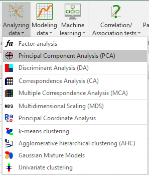
Once XLSTAT is activated, select the XLSTAT / Analyzing data / Principal components analysis command (see below).
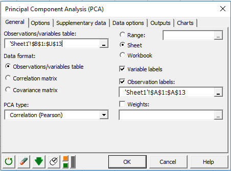
The Principal Component Analysis dialog box will appear.
In this example, the data start from the first row, so it is quicker and easier to use columns selection. This explains why the letters corresponding to the columns are displayed in the selection boxes. The Data format chosen is Observations/variables because of the format of the input data.
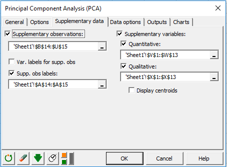
In the Supplementary data tab, we choose the two last rows as supplementary observations, Acidity and Sweetness as quantitative supplementary variables and Texture as a qualitative supplementary variable. We also can check the display centroids option to display the centroids of each category on the observation graph. Here, we will see how to color observation according to their category.
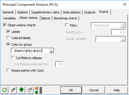
In the Charts tab, and the Observations sub-tab, we can check the Color by group option and select our qualitative supplementary variable Texture to color observations according to the category they belong to.
Interpreting the results of a Principal Component Analysis in Excel using XLSTAT
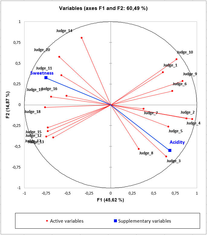
How to interpret the variables graph with quantitative supplementary variables?
Here, the supplementary variables Acidity and Sweetness allow us to identify two kind of consumers: those who prefer products characterized by an acidity and those who prefer products by a sweet taste. Without this information, we would not be able to explain the differences between those two clusters of consumers. Products on the right-side of the of the observations graph will be characterized by an acidity and preferred by the right cluster of judges. Products on the left of the observation graph will be characterized by a sweet taste and preferred by the left cluster of consumers.
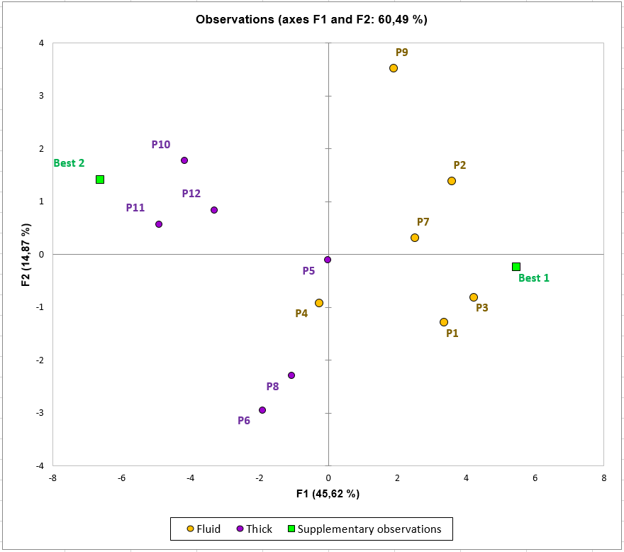
How to interpret the observations graph with qualitative supplementary variables and supplementary observations?
On this graph, we can see that one group of products (P1, P2, P3, P7) is preferred by the judges situated in the right half of the correlation plot. These consumers like the acidity of these products. The Best 1 prototype seems to be a good product for this kind of consumers expectations. Moreover, this group of products is characterized by a fluid texture. On the other hand, products P10, P11, and P12 are preferred by judges in the left half of the correlation plot. This kind of consumers seems to like products with a sweet taste and a thick texture. Best 2 looks like a good candidate for this kind of consumers.
Was this article useful?
- Yes
- No