Principal Component Analysis (PCA) in Excel tutorial
This tutorial will help you set up and interpret a Principal Component Analysis (PCA) in Excel using the XLSTAT software.
Dataset for running a principal component analysis in Excel
The data are from the US Census Bureau and describe the changes in the population of 51 states between 2000 and 2001. The initial dataset has been transformed to rates per 1000 inhabitants, with the data for 2001 serving as the focus for the analysis.
Goal of this tutorial
Our goal with this PCA example is to analyze the correlations between the variables and to find out if the changes in population in some states are very different from the ones in other states.
How to set up a Principal Component Analysis in Excel using XLSTAT?
-
Open XLSTAT
-
Select the XLSTAT / Analyzing data / Principal components analysis command. The Principal Component Analysis dialog box will appear.
-
Select the data on the Excel sheet. In this example, the data starts from the first row, so it is quicker and easier to use columns selection. This explains why the letters corresponding to the columns are displayed in the selection boxes.
-
Select Observations/variables in the Data format field because of the format of the input data.
-
Select Correlation in the PCA type field. The PCA type that will be used during the computations is the Correlation matrix, which corresponds to the Pearson correlation coefficient. Covariance matrices allocate more weight to variables with higher variances. Spearman's correlations may be more appropriate when running the PCA on variables with different distributions.

-
In the Outputs tab, activate the option to display significant correlations in bold characters (Test significancy).
-
In the Charts tab, in order to display the labels on all charts, and to display all the observations (observations charts and biplots), uncheck the filtering option. If there is a lot of data, displaying the labels might slow down the global display of the results. Displaying all the observations might make the results unreadable. In these cases, filtering the observations to display is recommended.
-
Click OK to launch the computations.
-
Confirm the axes for which you want to display plots. In this example, 67.72% of the variability is represented by the first two factors, but it may be useful to select other axis combinations to complete and refine the analysis if relevant.

How to interpret the results of a Principal Component Analysis in Excel using XLSTAT?
What is Principal Component Analysis?
Principal Component Analysis is a very useful method to analyze numerical data structured in a M observations / N variables table. It allows to:
-
Quickly visualize and analyze correlations between the N variables,
-
Visualize and analyze the M observations (initially described by the N variables) on a low dimensional map, the optimal view for a variability criterion,
-
Build a set of P uncorrelated factors
The limits of Principal Component Analysis stem from the fact that it is a projection method, and sometimes the visualization can lead to false interpretations. There are however some tricks to avoid these pitfalls.
It is also important to note that PCA is an exploratory statistical tool and does not generally allow to testing hypotheses. The advantage of this aspect is that PCA's may be run several times with observations or variables being removed or added at every run, as long as those manipulations are justified in the interpretations.
How to interpret a PCA correlation matrix?
The first result to look at is the correlation matrix. We can see right away that the rates of people below and above 65 are negatively correlated (r = -1). Either of the two variables could have been removed without effect on the quality of the results. We can also see that the Net Domestic Migration has low correlation with the other variables, including the Net International migration. This means that U.S. nationals and non-nationals may be moving to a state for different sets of reasons.

How to interpret Eigenvalues in Principal Component Analysis?
The next table and the corresponding chart are related to a mathematical object, the eigenvalues, which reflect the quality of the projection from the N-dimensional initial table (N=7 in this example) to a lower number of dimensions. In this example, we can see that the first eigenvalue equals 3.567 and represents 51% of the total variability. This means that if we represent the data on only one axis, we will still be able to see % of the total variability of the data.
Each eigenvalue corresponds to a factor, and each factor to a one dimension. A factor is a linear combination of the initial variables, and all the factors are un-correlated (r=0). The eigenvalues and the corresponding factors are sorted by descending order of how much of the initial variability they represent (converted to %).
Broadly speaking, factor = PCA dimension = PCA axis


Ideally, the first two or three eigenvalues will correspond to a high % of the variance, ensuring us that the maps based on the first two or three factors are a good quality projection of the initial multi-dimensional table. In this example, the first two factors allow us to represent 67.72% of the initial variability of the data. This is a good result, but we'll have to be careful when we interpret the maps as some information might be hidden in the next factors. We can see here that although we initially had 7 variables, the number of factors is 6. This is due to the two age variables, which are negatively correlated (-1). The number of "useful" dimensions has been automatically detected.
How to interpret results related to variables in PCA?
The first map is called the correlation circle (below on axes F1 and F2). It shows a projection of the initial variables in the factors space. When two variables are far from the center, then, if they are: Close to each other, they are significantly positively correlated (r close to 1); If they are orthogonal, they are not correlated (r close to 0); If they are on the opposite side of the center, then they are significantly negatively correlated (r close to -1).
When the variables are close to the center, some information is carried on other axes, and that any interpretation might be hazardous. For example, we might be tempted to interpret a correlation between the variables Net Domestic migration and Net International Migration although, in fact, there is none. This can be confirmed either by looking at the correlation matrix or by looking at the correlation circle on axes F1 and F3.

The correlation circle is useful in interpreting the meaning of the axes. In this example, the horizontal axis is linked with age and population renewal, and the vertical axis with domestic migration. These trends will be helpful in interpreting the next map. To confirm that a variable is well linked with an axis, take a look at the squared cosines table: the greater the squared cosine, the greater the link with the corresponding axis. The closer the squared cosine of a given variable is to zero, the more careful you have to be when interpreting the results in terms of trends on the corresponding axis. Looking at this table we can see that the trends for international migration would be best viewed on a F2/F3 map.

How to interpret results related to observations in PCA?
The next chart can be the ultimate goal of the Principal Component Analysis (PCA). It enables you to look at the observations on a two- dimensional map, and to identify trends. We can see that the demographics of Nevada and Florida are unique, as are the demographics of Utah and Alaska, two states that share common characteristics. Going back to the table, we can confirm that Utah and Alaska have a low population rate of people over age 65. Utah has the highest birth rate in the U.S., and Alaska ranks high as well.

It is also possible to display biplots, which are simultaneous representations of variables and observations in the PCA space.
Click to view a 3D visualization on the first three axes generated by XLSTAT-3DPlot.
Note on the usage of Principal Component Analysis
Principal component analysis is often performed before a regression, to avoid using correlated variables, or before clustering the data, to have a better overview of the variables. The number of clusters might sometimes be a simple guess based on the maps. The above demographic data have also been used in the tutorial on hierarchical clustering. The ">65 pop" variable has been removed as its inclusion would double the weight of the age variables in the analysis.
Going further
Adding supplementary variables to the PCA
It is possible to add supplementary variables to the PCA after it has been computed. This may help increasing interpretation quality. In XLSTAT, those variables can be selected under the Suppl. Data tab of the PCA dialog box. Supplementary variables can be divided into two types:
-
Qualitative supplementary variables: they allow to color observations on the map according to the category they belong to. In this tutorial's example, we could have added a column defining if a state is mostly republican or mostly democrat.
-
Quantitative supplementary variables: these variables can be added to see how they correlate with the group of variables that have been used to build the PCA. In the case where PCA is performed before a regression, the explanatory variables can be used to construct the PCA while the dependent variable can be added as a supplementary variable. This may help to roughly detect which explanatory variables could have the strongest effects on the dependent variable.
Running an Agglomerative Hierarchical Clustering (AHC) after a PCA
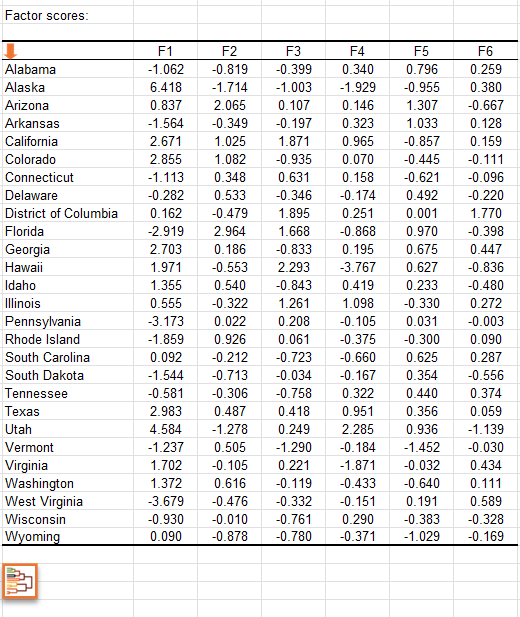
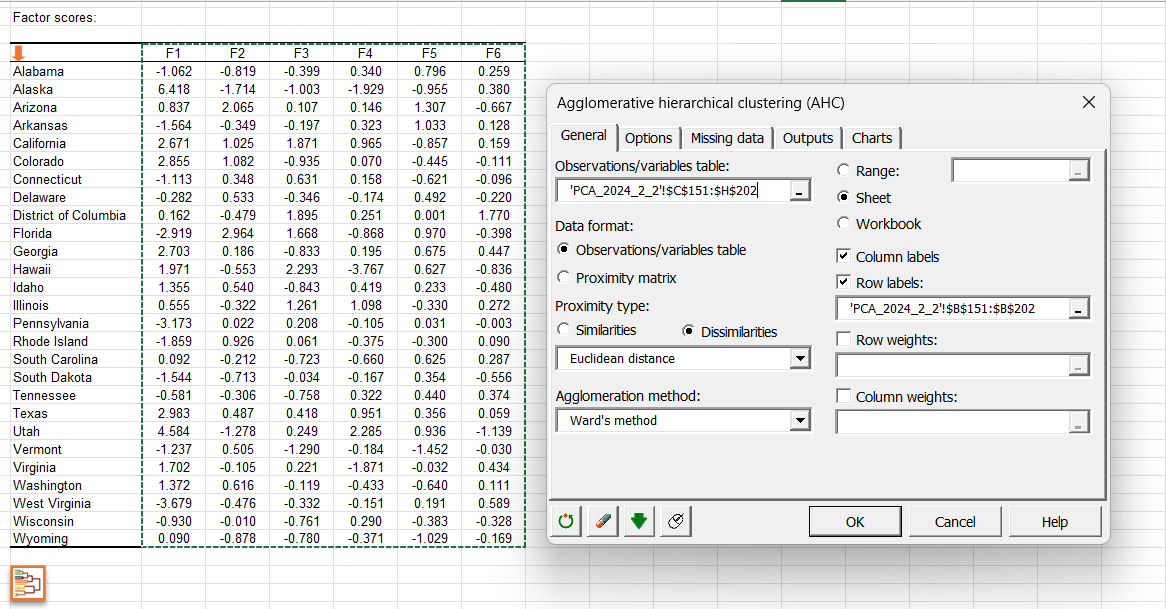
You can also launch an AHC by clicking on the button below the table of factor scores. An orange arrow allows you to go directly to the end of the table if it contains many variables.
By clicking on this button, the AHC dialog box is then automatically configured and you just have to click on the OK button to launch the analysis.
Click here to see how to interpret the results of the AHC analysis.
Watch our video on PCA analysis
The following video will help you better understand PCA and its implementation in XLSTAT.

Was this article useful?
- Yes
- No