Agglomerative Hierarchical Clustering (AHC) in Excel
This tutorial will help you set up and interpret an Agglomerative Hierarchical Clustering (AHC) in Excel using the XLSTAT software.
Dataset to run an Agglomerative Hierarchical Clustering in XLSTAT
The data are from the US Census Bureau and describe the changes in the population of 51 states between 2000 and 2001. The initial dataset has been transformed to rates per 1000 inhabitants, with the data for 2001 serving as the focus for the analysis.
Goal of this tutorial
Our aim is to create homogeneous clusters of states based on the demographic data we have available.
Setting up an Agglomerative Hierarchical Clustering
-
Once XLSTAT is activated, go to XLSTAT / Analyzing data / Agglomerative Hierarchical Clustering.
-
The Hierarchical Clustering dialog box will appear. Then select the data on the Excel sheet.
Note: There are several ways of selecting data with XLSTAT - for further information, please check the section How to select data in our XLSTAT tutorials.
-
In this example, the data start from the first row, so it is quicker and easier to use columns selection. This explains why the letters corresponding to the columns are displayed in the selection boxes.
-
The "Total population" variable was not selected, as we are interested mainly in the demographic dynamics. The last column was not selected as it is fully correlated with the column preceding it.
-
Since the name of each variable is present at the top of the table, we must check the Variable labels checkbox. Also, row labels are selected.
-
By default, we use the Euclidean distance and Ward’s method as the agglomeration method.

-
In the Options tab, the Center/Reduce options were selected to avoid having cluster creation influenced by scaling effects.
-
We checked the truncation option and in order not to have to define an arbitrary number of clusters, we have used the Hartigan index. This index allows you to compare the quality of several clusters according to a defined number of clusters.
-
We would like a number of clusters between 2 and 5. The Hartigan index will automatically define the appropriate number of clusters within this range.
-
The computations begin once you have clicked on OK.
Interpreting the results of an Agglomerative Hierarchical Clustering
The first result to look at is the levels bar chart. The shape reveals a great deal about the structure of the data. When the increase in dissimilarity level is strong, we have reached a level where we are grouping groups that are already homogenous but are heterogenous among themselves.

The chart below is the dendrogram. It represents how the algorithm works to group the observations, then the subgroups of observations. As you can see, the algorithm has successfully grouped all the observations.
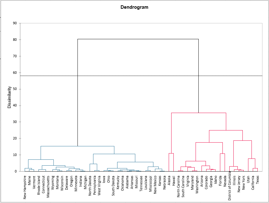
The dotted line represents the automatic truncation, leading to two clusters. The first cluster (displayed in blue color) is more homogeneous than the second one (it is flatter on the dendrogram). The Hartigan index defined 2 as the appropriate number of clusters. The following table tells why we obtained 2 clusters.
Indeed, the table informs on the evolution of the Silhouette index, the Hartigan index and the Calinski and Harabasz index, for each number of clusters from 2 to 5.
In that case, we look at the second and third lines. The second line shows the evolution of the Hartigan index, whereas the third shows the evolution of the difference between the index of a clustering with k clusters and a clustering with (k-1) clusters. The number of clusters of the greater difference (the value displayed in bold) indicates how many clusters we should create and here it is 2.

The following table shows the states that have been classified into each cluster. When looking at the Within-class variance, it is confirmed that the first cluster (on the left of the dendrogram) is more homogeneous than the second, the variance is a lot higher for the second cluster (on the right) than for the first one.

A table with the class ID for each State is displayed on the results sheet. A sample is shown below. This table is useful as it can be merged with the initial table for further analyses, for example, an ANOVA or parallel coordinates plot.

The Silhouette score of each observation can also be displayed, if the score is close to 1, the observation lies well in its cluster.
Finally, this score can be represented in a chart with sorted observations in descending order and by cluster, in order to judge the quality of the obtained clustering. Negative indices for observations of cluster 2 prove again the low homogeneity of this cluster in comparison with cluster 1.

Conclusion on Agglomerative Hierarchical Clustering
We performed an Agglomerative Hierarchical Clustering and thanks to the Hartigan index, we have separated the states into two clusters. However, one cluster is more homogeneous than the other. It is possible to get a better clustering with two homogeneous clusters by using the consolidation with the k-means algorithm. For this purpose, you can activate the consolidation option in the Options tab.
Note: if the distance used is not the Euclidean distance and the agglomeration method is not Ward’s method, adaptations of the Hartigan and the Calinski and Harabasz indices are proposed by our teams to help you choose the best number of classes.
This video shows how to do this tutorial.
Was this article useful?
- Yes
- No