Analysis of Free Sorting data with Excel
This tutorial shows how to compute and interpret a Free Sorting data analysis in Excel using the XLSTAT software.
Free Sorting dataset
The data used to illustrate the Free Sorting analysis relates to an experiment where 25 subjects from Product Perceptions Ltd tasted 14 different chocolates and made groups of them.
These data are precisely described in Courcoux, P., Faye, P., & Qannari, E. M. (2014). Determination of the consensus partition and cluster analysis of subjects in a free sorting task experiment. Food Quality and Preference, 32, 107–112.
Goal of this tutorial
The aim here is to study two characteristics of Free Sorting data:
- The links between products, i.e. chocolates herein.
- The agreements between consumers, individually and globally.
For this purpose, we will use the Free Sorting data analysis function of XLSTAT. This tool will allow us to visualize the links between products as well as calculate similarity indices between consumers. Finally, a graphical representation of consumers will also be proposed.
Setting up a Free Sorting data analysis in XLSTAT
Select the XLSTAT / Advanced features/ Sensory data analysis/ Free Sorting data analysis feature (see below).
The Free Sorting data analysis dialog box appears.
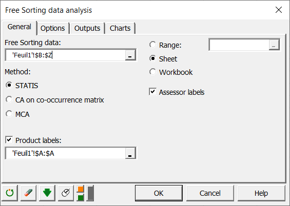
In the General tab, you can then select the Free Sorting data.
The Method indicates your approach choice. STATIS will use the indicated method following an appropriate pre-treatment. CA on the co-occurrence matrix will perform a Correspondence Analysis on the product co-occurrence matrix. Finally, MCA will use a Multiple Correspondence Analysis on the raw data selected.
Here our assessors contain labels, so we check the box Assessor labels to indicate it to XLSTAT. Moreover, we select the Product labels of the task.
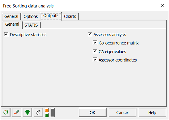
In the Outputs tab, if you select the Assessors Analysis box, you will then have an analysis based on the proximity of the answers of the different assessors in order to make a graphical representation.
In the Charts tab, if you select the Display charts on two axes box, you will automatically have the representation on the first 2 factorial axes of the different maps. If you uncheck it, a window will open and you will be able to choose your axes.
Interpreting the results of a Free Sorting data analysis in Excel using XLSTAT
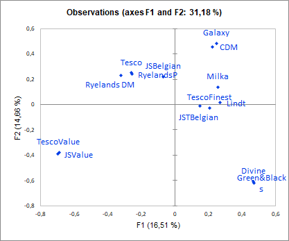
One of the most important results of Free Sorting data is the graphical representation of products and attributes. On the following graph we can see on the one hand that we have 31.18% inertia reported by our first two axes, which is very common in the case of qualitative variables. However, it is recommended to look at axes 3 and 4, but in our case no additional information is given.
The graph shows that the assessors found 5 groups of chocolates overall. Moreover, it is clear that the group consisting of Divine and Green&Blacks as well as the group containing JSValue and TescoValue are completely different from the others.
Homogeneity is a global index (between 1/number of assessors and 1) of agreement between consumers. The value is 0.639 herein, which is correct but shows differences in points of view between consumers.
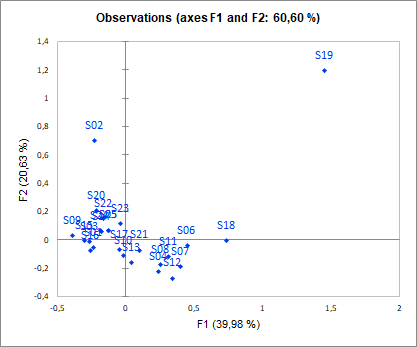
![]() In order to more precisely study these differences between consumer points of view, the assessor analysis allows to represent them. We see clearly in our data that subject S19 has a completely different point of view from the other subjects. One solution could be to remove this subject and repeat the analysis.
In order to more precisely study these differences between consumer points of view, the assessor analysis allows to represent them. We see clearly in our data that subject S19 has a completely different point of view from the other subjects. One solution could be to remove this subject and repeat the analysis.
Was this article useful?
- Yes
- No