Analysis of temporal check-all-that-apply (TCATA) data in Excel
This tutorial shows how to compute and interpret an analysis of TCATA data in Excel using the XLSTAT software.
Dataset for a TCATA data analysis
The data used here refers to a TCATA experiment where 50 assessors evaluated 6 orange juice (products) using 6 attributes over a period of 30 seconds. For this tutorial, the dataset has been reduced to the study of only 3 products from 0 to 20 seconds.
These data are precisely described in Ares et al. (2016). Comparison of TCATA and TDS for dynamic sensory characterization of food products. Food Research International, 78, 148-158.
Goal of this tutorial
The aim here is to describe the sensory properties of different products over time and possibly highlight differences between products.
For this purpose, we will use the TCATA function of XLSTAT. This tool will allow us to display curves characterizing the products and to better understand their sensory properties. The setting will be followed by the interpretation of the outputs.
Setting up a TCATA data analysis in XLSTAT
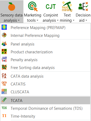
Select the XLSTAT / Advanced features / Sensory data analysis / TCATA Command (see below).
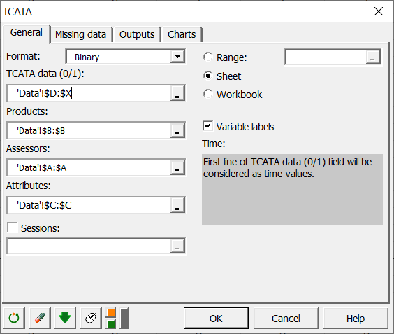
 The TCATA dialog box appears.
In the General tab, select the Binary format because TCATA data (columns D to X) are in binary format, this means for each row (product / assessor / attribute combination) a binary vector of size 21 (from 0 to 20 seconds) characterizes the combination with 1 if the attribute is selected at time t and 0 otherwise. Since the Variable Label option is selected the first line of the TCATA Data Selection (0/1) is considered the time vector. Then select columns A, B and C respectively in the Assessors, Products and Attributes fields.
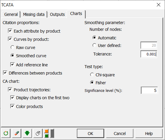
 In the Charts tab, activate the following options:
Interpreting the results of a TCATA data analysis in Excel using XLSTAT
The first interesting result concerns the summary table in order to check your data.
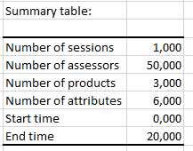 We can see that 3 products were evaluated by 50 assessors on the basis of 6 attributes and over a duration of 0 to 20 seconds.
Then the bar chart of citation proportions for each attribute of each product are displayed, this gives a first idea of the characterization of the products according to the different attributes.
Then the smoothed citation proportions curves are displayed for each product with significant reference lines.
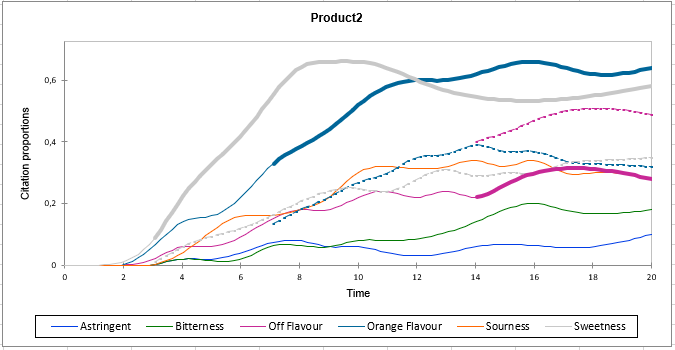 This chart shows the citation proportions of each attribute for product 2. Dashed lines correspond, for the attribute concerned, to the significant reference lines of the other pooled products. When a significant reference curve is displayed, the corresponding attribute curve is displayed with a thicker line.
We see here for example that Orange flavour is significantly more present on this product from time 7 to time 20 compared to the other products pooled together. On the other hand, Off flavour is significantly compared to other products from time 14 to time 20 because the curve of this attribute is below the significant reference curve.
This chart shows the citation proportions of each attribute for product 2. Dashed lines correspond, for the attribute concerned, to the significant reference lines of the other pooled products. When a significant reference curve is displayed, the corresponding attribute curve is displayed with a thicker line.
We see here for example that Orange flavour is significantly more present on this product from time 7 to time 20 compared to the other products pooled together. On the other hand, Off flavour is significantly compared to other products from time 14 to time 20 because the curve of this attribute is below the significant reference curve.
Then the charts of significant differences in citation proportions between products are displayed for each product pair.
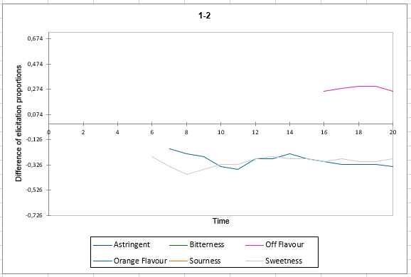 This graph shows for example that the proportion of citation of the Sweetness attribute between times 7 and 20 is significantly lower on product 1 compared to product 2. However, the proportion of citation of the Off flavor attribute between times 16 and 20 is significantly higher on product 1 compared to product 2.
Finally, the chart of the product trajectories from CA is displayed.
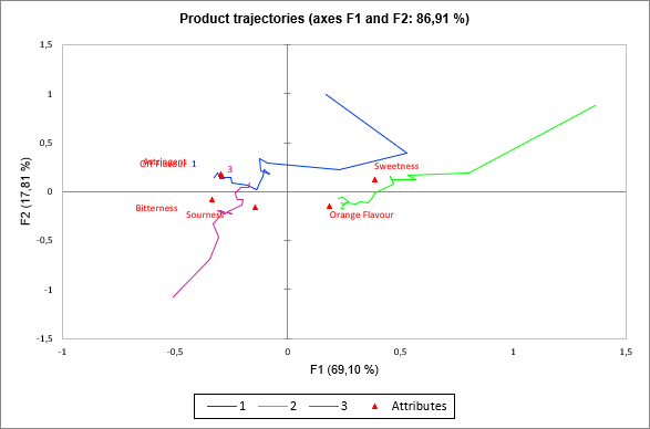 This chart shows, for example, that product 2 on the right of the chart is associated with Orange flavour and sweetness attributes. It can also be seen that product 1 tends to be characterized by Sweetness attributes and Orange flavor at the beginning but then it is rather characterized by Off flavor attribute. These conclusions can be seen in the charts of the product curves presented above.
Was this article useful?
- Yes
- No