Fuzzy k-means clustering in Excel
This tutorial will help you set up and interpret a fuzzy k-means clustering in Excel using the XLSTAT software.
Dataset for fuzzy k-means clustering
In this tutorial, we will use a document-term matrix generated through the XLSTAT Feature Extraction functionality where the initial text data represents a compilation of female comments left on several e-commerce platforms. The analysis was deliberately restricted to the first 5000 rows of the dataset.
Note: if you try to re-run the same analysis as described below on the same data, as the k-means method starts from randomly selected clusters, you will most probably obtain different results from those listed hereunder, unless you fix the seed of the random numbers to the same value as the one used here (123456789). To fix the seed, go to the XLSTAT Options, Advanced tab, then check the "fix the seed" option.
Setting up a Fuzzy k-means clustering
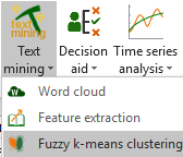
Once XLSTAT is activated, select the XLSTAT / Advanced features / Text mining / Fuzzy k-means clustering command (see below).
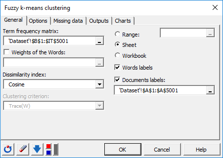
 After clicking the button, the dialog box for the Fuzzy k-means clustering appears. You can then select the data via the Term frequency matrix field (cells range selection). The Document labels option is enabled because the first column of data contains the document names. The Word Labels option is also enabled because the first row of data contains term names.
The Dissimilarity index selected here is the distance based on the cosine between two-term vectors («1 - Cosine similarity**»**), which allows standardization of vectors to be classified and avoids dissociating documents of different sizes but whose proportions of terms remain identical.
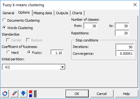
In the Options tab, we increased the number of iterations to 50 in order to increase the quality and the stability of the results. The algorithm will be launched 20 times, with each time a new random starting point.
The initial partition will be defined by the algorithm K|| [Bahmani2012], which is a faster implementation of kmeans ++. This initialization chooses the next group center as far as possible from the already chosen centers, thus making it possible to limit the undesirable effects caused by aberrant points during initialization.
A number of classes of 30 were selected here. This can be however adjusted after observing the plot of the evolution of the criterion (according to different numbers of centers (k) in order to determine the inflection point corresponding to the moment when the explained variance gain (ratio between interclass variance and total variance) begins to decrease (Elbow method).
A coefficient of fuzziness of 1.10 will be applied here to allow certain observations located at the periphery of a group to belong at the same time to several different groups (soft clustering). This coefficient also makes it possible to reduce the effect of outliers.
 The computation begins once you have clicked on OK.
Interpreting a fuzzy k-means clustering
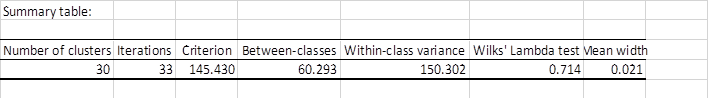
After the basic descriptive statistics of the selected variables, XLSTAT indicates how the variance decomposes for the optimal classification criterion.
 The following table shows the terms assigned to each group.
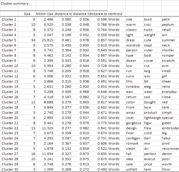 Generated classes are associated with terms that appear frequently in the same documents. For example, Cluster 11 contains the terms "run" "large" and "small" which most certainly links these words to a negative sentiment and then replace them in all the reviews with the "Size issues" thematic.
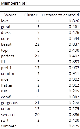
The Memberships table presents for each word, the identifier of the group to which it has been assigned. The latter one is calculated by choosing the group for which the term’s membership probability is maximal (See Membership probabilities table in the report of the demo file). Part of this table is shown below. Cluster 17 contains several positive sentiments.
We can then use these generated groups or "topics" for possible additional analyzes by associating them with a dependent variable that must be predicted (for example a supervised classification using Support Vector Machine on feelings associated with the comments).
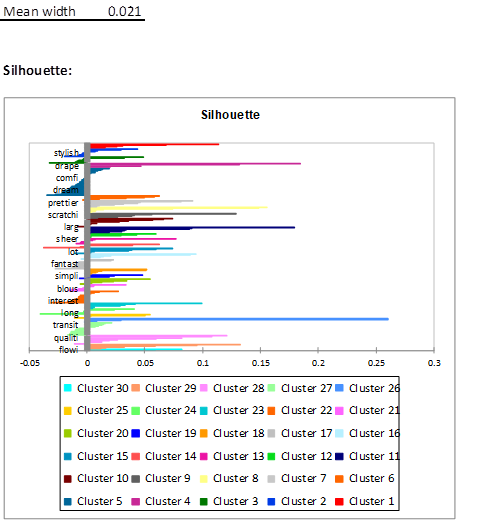
 The following figure shows the silhouette plot which indicates the degree of similarity of each observation with respect to its class. The closer these values are to 1, the better the classification. The average of all these values is another overall indicator of quality. The latter highlights a number of observations within each cluster with a high average similarity indicating the presence of strongly correlated terms within each of these groups.
¿Ha sido útil este artículo?
- Sí
- No