COVID-19 DATA ANALYSIS IN EXCEL
This tutorial shows how to perform and interpret a COVID-19 data analysis in Excel using the XLSTAT software.
Installing the COVID-19 tool
To access the tool, you will need Excel installed on your computer (version 2016 or later for Mac users, Excel 2007 and later for Windows users), and the latest XLSTAT version. If you are currently using our trial version or if you have a valid license, you can download this version for free at:
If you have never used before XLSTAT, you can download it on our website.
Activating the COVID-19 tool
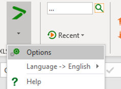
To activate the COVID feature, you first need to go to the > menu, then choose Options and activate the COVID-19 option.
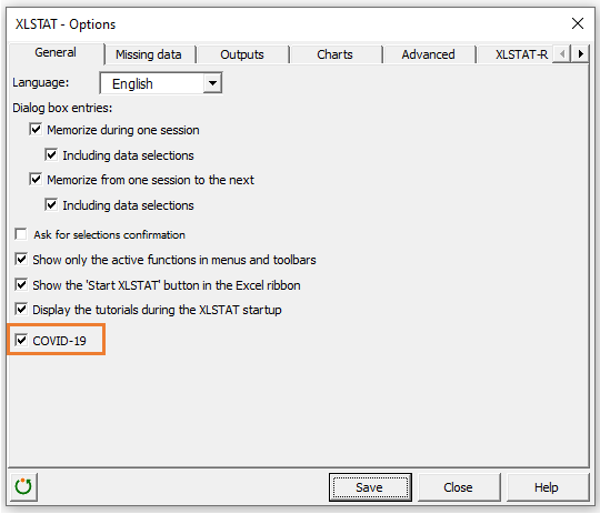
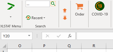
Once you click Save and then Close, the COVID-19 feature is displayed.
Setting up the COVID-19 tool
Upon clicking on the COVID-19 icon, the following dialog box will appear:
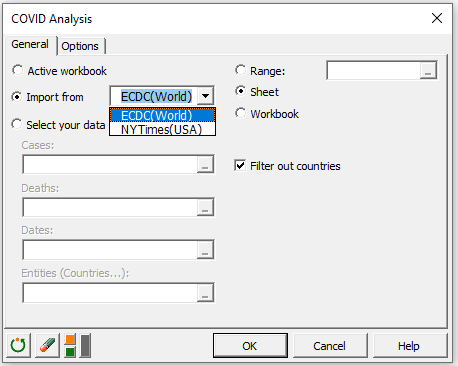
1. Using the active workbook
If you do not want to reimport data because you have already loaded it, simply choose "Active workbook" as the option to obtain data. XLSTAT will automatically import the data from the first sheet of the workbook. You can use your own data, but the XLSTAT expects the exact same format (column headers) as for the ECDC data.
2. Importing from ECDC or NYTimes
The default option for the import of the data is "Import from ECDC". This option allows XLSTAT to automatically download the latest ECDC the data available. We recommend you use this option on a daily basis if you want to access the most recent information available. For your information, the ECDC updates its data daily, usually every afternoon. If you want to update the dataset before the ECDC releases new figures, you can insert rows in the data imported from the ECDC as long as you respect the organization's data format.
3. Selecting your own data
If you'd like to use your own data (if you are managing several hospitals for instance) you can choose "Select your data" and select your own data. You currently need to select the data corresponding to cases, deaths, dates, and entities (if you are working on data for a single entity, you still need to have a column with the name of the entity on each row. This constraint will be removed shortly).
If you want to remove countries from your analysis, you can click the "Filter out countries" option at any time.
In the Options tab of the dialog box, there are a few additional options. One allows you to select any country (or entity) you wish to focus on. This will allow you to see the predictions of the XLSTAT model (see below) from the beginning of the outbreak until today.
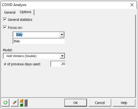
There is currently only one model available. It is based on the double exponential Holt Winters smoothing model. You can choose how far back in time (number of days) you wish to collect the data.
Interpreting the results of a COVID analysis
Once you click on the OK button to run your analysis, XLSTAT automatically processes the data, generates summary statistics and builds predictions and charts.
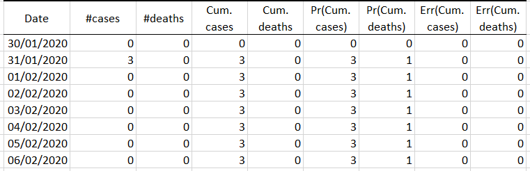
The first table displays the general statistics for each available country, excluding the ones you may have filtered out. For all countries in which the outbreak started before January 1, 2020, the ECDC has merged all prior data into a unique dataset (31st Dec 2019).
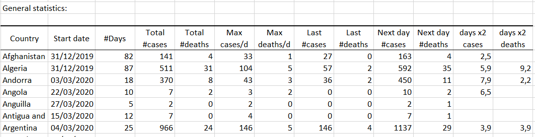 After the start date (which is not accurate for countries where cases had been already reported in 2019), you will find the number of days since the first case, the total number of cases, the total number of deaths, the maximum number of cases per day, the maximum number of deaths per day, the last number of cases, the last number of deaths, the predicted number of cases for the next date, the predicted number of deaths for the next day, the number of days predicted before the number of cases doubles, and the same for fatalities.
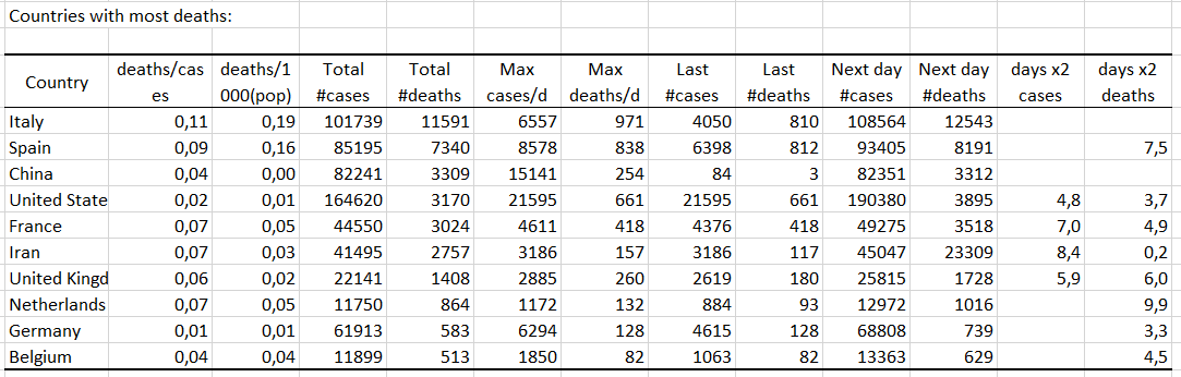
A second table displays the 10 countries with most deaths recorded.
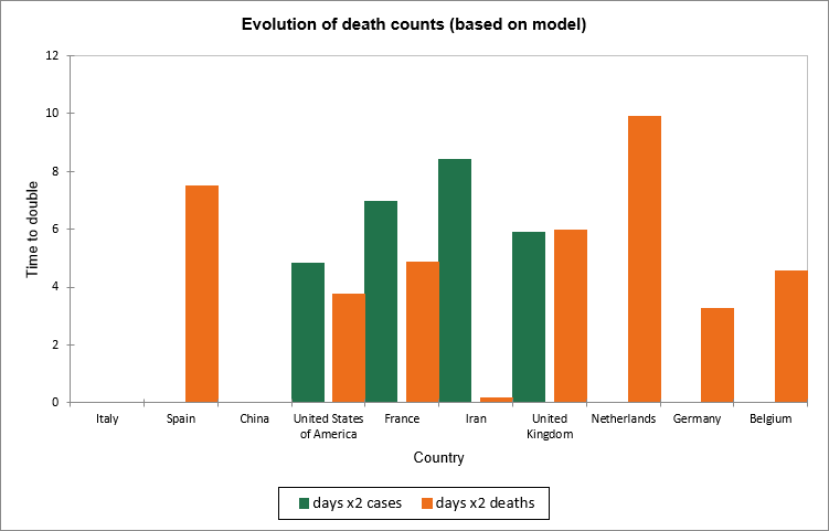
 The table is followed by a chart that compares the number of days before the number of cases and/or deaths are expected to double. That number is not displayed if it is above 10 or if it could not be computed.
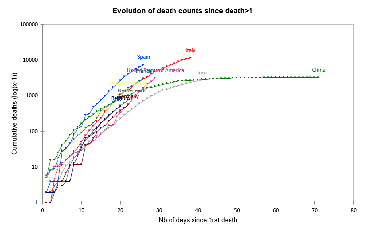
XLSTAT displays a chart that gives each country a trajectory since the number of deaths exceeded 2. The scale on the y axis is log. You can compare the situation for each country.
 A race chart is then displayed (Excel 2010 and later only) so that you can track the evolution of the number of fatalities for the same 10 countries day after day (the day is displayed at the top).
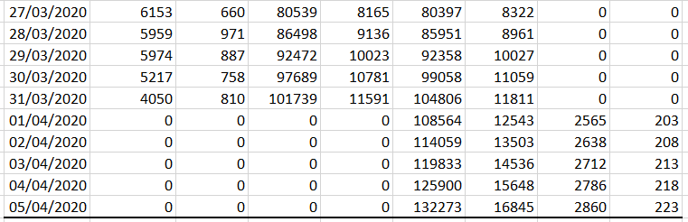
If a focus on a specific country was requested the last table displays the predictions performed by the model on a day by day basis. It also gives the predictions for the number of expected cases over the next 5 days, assuming that the counting method does not change and that no aggravating factors occur. When some countries reach their peak, the model will be inaccurate until the decrease stabilizes. The model does not detect the peak in its current version. We can see hereunder the results obtained for Italy on March 31st. In the last two columns we can see an estimate of the prediction error based on previous prediction errors, a concept that differs from the confidence interval but that we believe is more accurate.
....
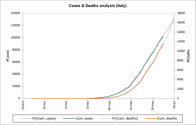
The last chart displays the data and the model predictions for both cases and deaths.
Was this article useful?
- Yes
- No