Logistische Regression in Excel - Anleitung
This tutorial will help you set up and interpret a Logistic Regression in Excel using the XLSTAT software. Not sure this is the modeling feature you are looking for? Check out this guide.
Principles of the logistic regression
Logistic regression, and associated methods such as Probit analysis, are very useful when we want to understand or predict the effect of one or more variables on a binary response variable, i.e. one that can only take two values 0/1 or Yes/No for example.
A logistic regression will be very useful to model the effect of doses of medication in medicine, doses of chemical components in agriculture, or to evaluate the propensity of customers to answer a mailing, or to measure the risk of a customer not paying back a loan in a bank.
With XLSTAT, it is possible to run logistic regression either directly on raw data (the answer is 0 or 1) or on aggregated data (the answer is a sum of successes - of 1 for example - and in this case the number of repetitions must also be available).
Logistic regression models the probability of an event occurring given the values of a set of quantitative and/or qualitative descriptive variables.
Data set for running a binary logit model
The example we consider below is a marketing scenario in which we try to predict the probability that a customer will renew his subscription to an online information service.
The data correspond to a sample of 60 readers, with the age category, the average number of page views per week over the last 10 weeks, and the number of page views during the last week. These readers were asked to renew their subscription which is due to expire in two weeks.
The goal is to understand why some have re-subscribed while others have not.
Goal of this tutorial on logistic regression
The goal is to use binary logistic regression to understand the results obtained from the study and then to apply the model to the entire population in order to identify people who might not renew their subscription.
With this information, the marketer can offer them a promotion or additional services to stimulate their interest in the offer.
Setting up a binary logit model
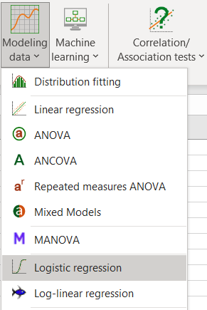
To activate the Binary Logit Model dialog box, start XLSTAT, then select the XLSTAT / Modeling data / Logistic regression.
Once you have clicked on the button, the dialog box appears. Select the data on the Excel sheet.
The Response data refers to the column in which the binary or quantitative variable is found (resulting then from a sum of binaries - in this case the "Weights" column must be selected next).
In our case there are three explanatory variables, one qualitative - the age class - and two quantitative corresponding to the counts of page views.
Since we have selected the labels of the variables, we must select the option Variable labels.

Once you have clicked on the OK button, the calculations are performed and the results displayed.
Interpret the results of a binary logit model
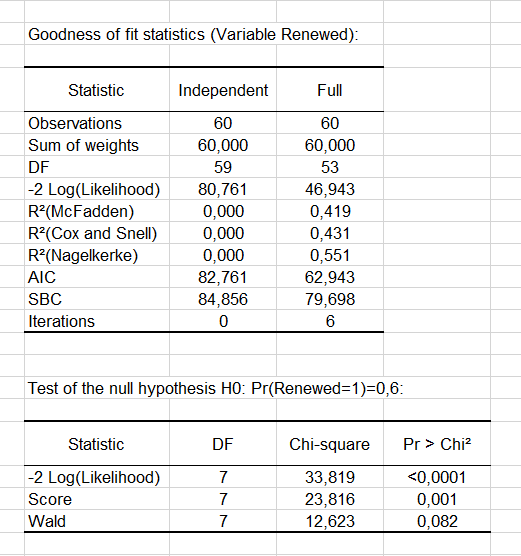
The goodness-of-fit statistics table gives several indicators of the quality of the model (or goodness of fit). These results are equivalent to the R² in the linear regression and to the ANOVA table. The most important value is the Chi² associated with the Log ratio (L.R.). It is the equivalent of Fisher's F-test of the linear model: we try to evaluate if the variables provide a significant amount of information to explain the variability of the response variable. In our case, as the probability is lower than 0.0001, we can conclude that the variables bring a significant amount of information.
 Next, the Type II analysis table gives the first details about the model. It is useful for evaluating the contribution of the variables to the explanation of the response variable.
 From the probability associated with the Chi-square tests, we can see that the variable that most influences the renewal is the number of pages viewed the previous week (p = 0.012).
As the Age variable is qualitative (because it is divided into groups), we can determine whether each modality influences the renewal decision. It appears that the group of “40-49” age has a significant negative impact (-2.983). Marketing and editorial managers can investigate this further to understand why. The other age groups do not have any significant effect.

Next, you can view the Predictions and Residuals table. We can see that for the 7th observation, the reader claims not to be interesting in renewing his subscription whereas the model predicts a renewal of the subscription. Indeed we can see that the probability of renewing is estimated at 0.757 while the probability of not renewing is estimated at 0.243.
The column Significant change indicates that the change in value between the predicted modality and the observed one. The second column Significant indicates if the probability of the predicted modality is significantly different than the ones of the other modalities. In the case of the 7th observation, we can see that the change is significant and the probability of renewing (0.757) is higher than that of not renewing (0.243).
Note that these two columns appear if the Significance analysis option has been checked in the "Outputs" tab of the dialog box.

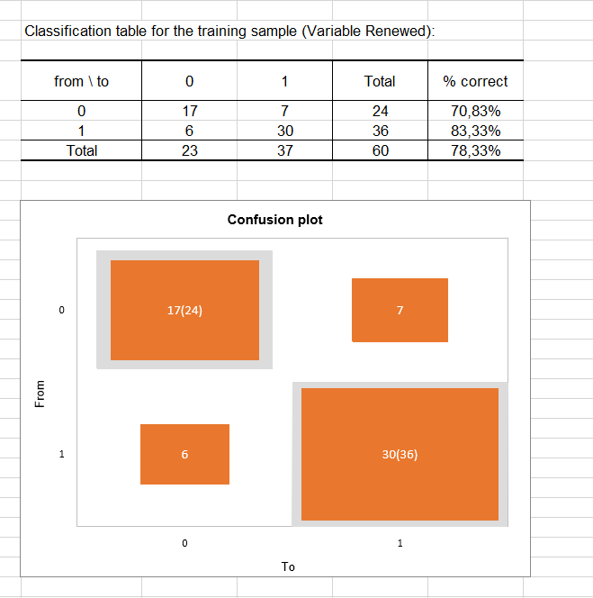
The classification table for the training sample (sometimes called the confusion matrix) is then displayed in the report. This table shows the percentage of observations that were well classified for each modality (true positives and true negatives). For example, we can see that the observations of modality 0 (no renewal) were well classified at 70.83% while the observations of modality 1 (renewal) were well classified at 83.33%.
The confusion plot allows to visualize this table in a synthetic way. The grey squares on the diagonal represent the observed numbers for each modality. The orange squares represent the predicted numbers for each modality. Thus, we can see that the surfaces of the squares almost completely overlap for the two modalities (17 well predicted observations out of 24 observed observations for modality 0 and 30 well predicted observations out of 36 observed observations for modality 1).
Finally, the last two tables take into account the uncertainty. Most the predictions made for modality 0 can be considered as uncertain (95.83%), while for modality 1 the predictions are much less uncertain with a percentage of uncertainty being at estimated at 33.33%.
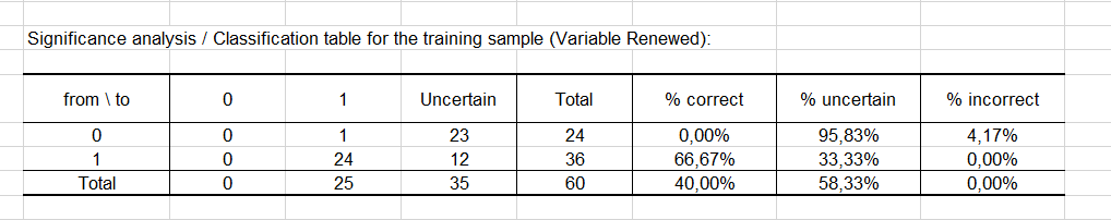
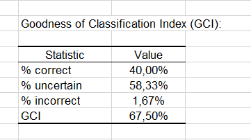
The GCI table shows that 40% of the observations were well classified (true positives), 58.33% had an uncertain classification and only 1.67% were incorrectly classified (false positives and false negatives cumulated). The GCI (Goodness of Classification Index) is 67.50%, which means that the predictive quality of this classification model is good.
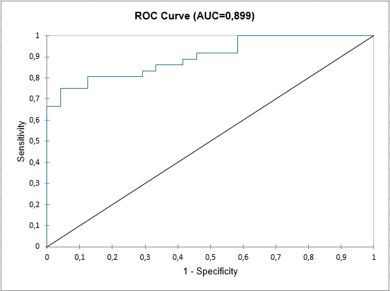
At the end of the XLSTAT output sheet, the ROC curve is displayed. It is used to visualize the performance of a model, and to compare it with that of other models.
The area under the curve (or AUC ) is a synthetic index calculated for ROC curves. The AUC corresponds to the probability such that a positive event has a higher probability given to it by the model than a negative event. For an ideal model, AUC=1 and for a random model, AUC = 0.5. A model is usually considered good when the AUC value is greater than 0.7. A well-discriminating model must have an AUC of between 0.87 and 0.9. A model with an AUC greater than 0.9 is excellent.
War dieser Artikel nützlich?
- Ja
- Nein