Frequencies, mode & bar charts in Excel
This tutorial illustrates frequencies and mode statistics as well as bar charts for qualitative data (also referred to as categorical or nominal data), in Excel using the XLSTAT software.
Dataset for describing qualitative data
The data represent the results of a survey on how people living in two different cities commute to work. Rows correspond to respondents and columns to the mode of transportation as well as to the city they live in.
Here the city and the mode of commuting are qualitative variables, also referred to as nominal or categorical variables. The values a qualitative variable may take (Bicycle, Bus, Car… in the case of transportation mode) are called categories, or levels. Our goal here is to describe transportation preferences when commuting to work per city using:
-
Common Descriptive statistics:
-
The mode, reflecting the most frequent mode of commuting (the most frequent category).
-
The frequencies, reflecting how many times each mode of commuting appears as an answer.
-
The relative frequencies, which is the frequency divided by the total number of answers.
-
Bar charts and stacked bars, that graphically illustrate the relative frequencies by category.
This will allow us to extract the key figures of the survey and detect potential differences in the way people commute according to the two cities.
Setting up the dialog box for descriptive statistics of qualitative data
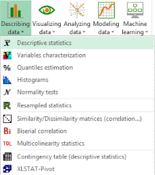
1. Once XLSTAT is open, select the XLSTAT / Describing data / Descriptive statistics command as shown below.
2. The Descriptive Statistics dialog box appears.
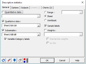
3. In the General tab, select the column corresponding to the mode of transportation in the Qualitative data field. As the goal is to describe transportation preference per city, we select the column corresponding to the city in the Subsamples field.
We also want to display Variable-Category labels in the output. These include the variable name as a prefix and the category name as a suffix. Finally, select the Sheet option in order to display the results on a new sheet and the Sample labels to consider the first row of the data table as labels.
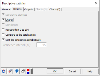
4. In the Options tab, activate the following options:
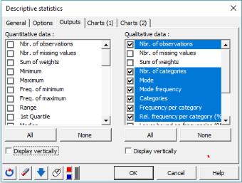
5. In the Outputs tab, select the following statistics: Nbr of observations, Nbr of categories, Mode, Mode frequency, Categories, Frequency per category and Rel. frequency per category (%).
6. In the Charts(2) tab, activate the following options.
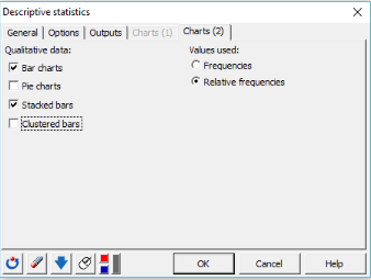
The bar charts allow to visualize the frequencies or relative frequencies of the various categories as bars. Here, we choose to use the relative frequencies. We also want to display the stacked bars to show the relative difference between categories within each sample.
Interpreting the results
Interpreting descriptive statistics for qualitative data
The results are displayed on the new sheet named Desc (see below).
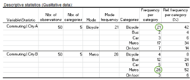
The table provides the following information for the two sub-samples:
-
The number of observations: 100 people participated in the survey, 50 from each city.
-
The number of categories: 5 different forms of transport appeared in the answers.
-
The mode and the mode frequency: Bicycle is preferred by people living in city A (mode frequency=21) while metro is the most popular commuting mode for those living in city B (mode frequency=26).
-
The Frequency per category: Three respondents from city B replied that they commute to work on foot while 12 said they go by bus.
-
The Relative frequency per category (%): 42% of the respondents living in city A go to work by bicycle while only 3% use their car.
Interpreting bar charts and stacked bar charts
-
Bar charts
The next two charts provide a comparison of the different categories for each sub-sample. A bar represents the relative frequency of a specific category. The tallest bar corresponds to the mode, which is the category with the largest relative frequency.
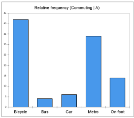
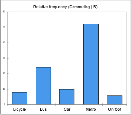
From the first chart, we can easily confirm that bicycle is the mode category of city A with at least 40% of the respondents choosing this form of commuting. Individuals from city B seem to prefer public means of transport as the bars of metro and bus sum up to more than a 70% relative frequency.
We may thus say that city A is more cycle-friendly than city B or that people living in city B work relatively far from their home so cycling or walking is not the best option for them.
-
Stacked bars
The advantage of a stacked bar is that we can analyze the breakdown of each sample into its constituent categories. Here, the stacked bar chart shows the percentage contribution of the different commuting modes to each city.
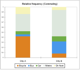
For example, we observe that around half of the individuals living in city B go to work by metro (gray part of the second bar) while walking is an option for just a few of them (yellow part of the second bar). Within city A, cycling to work has a great appeal (orange part of the second bar) while bus and car are the least used (green and blue parts of the first bar) related to the other forms of transports.
What’s next: using crosstabs to investigate the link between two qualitative variables
The contingency table, also called crosstab, is an efficient way to summarize the relationship between two categorical variables. XLSTAT offers a tool to generate a contingency table with a 3D view option and computes several statistics measuring the relationship between the two variables. Check out this tutorial.
The following video tackles qualitative descriptive statistics, with illustration using Excel and XLSTAT.
Was this article useful?
- Yes
- No