Customize a PCA chart for an easier interpretation
This tutorial shows how a Principal Component Analysis (PCA) chart can be customized for a better readability.
Dataset for customizing the plot
This tutorial uses the results obtained in the tutorial on PCA. (Principal Component Analysis).
Our goal is to improve the readability of the graphical representation of the observations on the F1 and F2 axes.
Customizing a plot
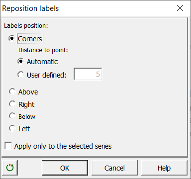
We first make a copy of the representation, and then enlarge it. It can be observed that during the expansion of the chart, some labels are moved away from the point to which they correspond. To remedy this, we select the graph and then we use the tool Reposition labels of the Visualizing data toolbar, and choose the following options :
We then create, to the right of the table of the factor scores, a column that contains the sum of the squared cosines on the first two axes for each observation.
As a reminder, for a given axis and a given observation, the cosine is the cosine of the angle between the axis and the vector going from the origin to the point. Thus, the greater the cosine, the closer the point is to the axis in the multidimensional space resulting from the PCA. The sum of the cosines on the first two factorial axes F1 and F2 for any given observation, gives an idea of the accuracy of the plane defined by F1 and F2, for this observation. For a given observation, the sum of the squared cosines over all axes is 1. So, for a given point, the closer the sum to 1, the greater the interpretability of the representation.
In order to indicate the level of interpretability of the two-dimensional representation for the various points, we want to increase the point sizes according to the value of the sum of the squared cosines. This will allow us to know which points can be interpreted without error.
Furthermore, to differentiate the five groups of States determined by the Census Bureau (North East, South, Midwest, West and Pacific), we will use different shapes.
To modify the shapes, we need to use the codes as defined by XLSTAT, the later respecting the order of shapes proposed by Excel (see the dialog box below): 1 corresponds to a square, 2 to a diamond, 3 to a triangle, 4 to an x, 5 to a star, 6 to a point, 7 to a -, 8 to a + and 9 to a circle. As only four shapes are effectively usable, the States of Hawaï and Alaska that belong to the Pacific zone will be represented with a circle as the western States, but with a black contour.

We then create a column that contains the codes corresponding to each State.
To increase the readability of the chart, we are going to color in red the points for which the sum of squared cosines is greater than 0.8. To change the color of the points, we must apply the colors to the cells where the shapes are defined. We first color the entire column of cosines in blue. Then we use the DataFlagger tool available in the "Tools" toolbar to color in red the cells with a sum greater than or equal to 0.8.
To surround with black the points corresponding to Hawaii and Alaska, a black bottom border has been added to the cells. The format of the cell is then copied and pasted into the column with the shapes, and we clear the formats in the column with the squared cosines (Excel / Edit / Clear formats).

We then select the graphic, and then launch the EasyPoints tool that is available in the "Visualizing data" toolbar. The following options were chosen:

As a result, we obtain the following chart:

Easier to interpret, this chart allows us to identify the states which can be interpreted in terms of proximity. For example, one can conclude that West Virginia and Pennsylvania are close, while Pennsylvania and Alaska are very different. Furthermore, we note that in the top right and bottom right of the representation, we mostly find Western States.
Was this article useful?
- Yes
- No