DataViz: a charts recommendation tool
Dataset to use with DataViz tool in XLSTAT
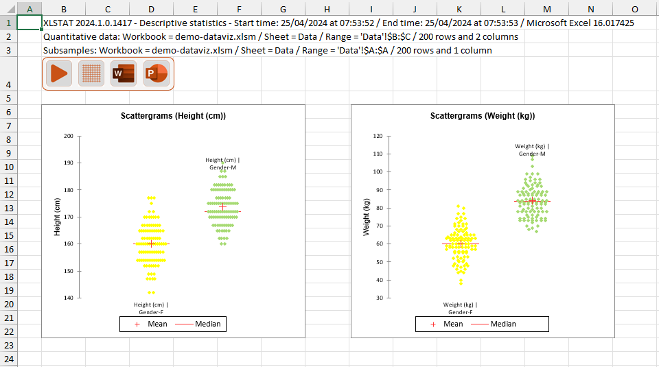
The dataset contains the weight and height of 100 men and 100 women.
Setting up the DATA SELECTION part
-
Open XLSTAT
-
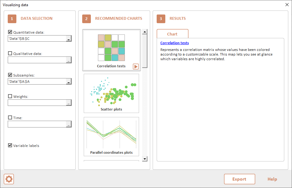
Select the XLSTAT/ Visualizing data / DataViz. The dialog box pops up.
-
In the DataViz interface, check Quantitative data. A new dialog box pops up.
-
Select the height and weight columns in the Quantitative data field.
-
In the DataViz interface, check Subsamples. A new dialog box pops up.
-
Select the gender column in the Subsamples field.
-
The RECOMMANDED CHARTS part is updated.
RECOMMENDED CHARTS
A list of recommended charts is displayed:
-
Use the scroll bar to navigate through them.
-
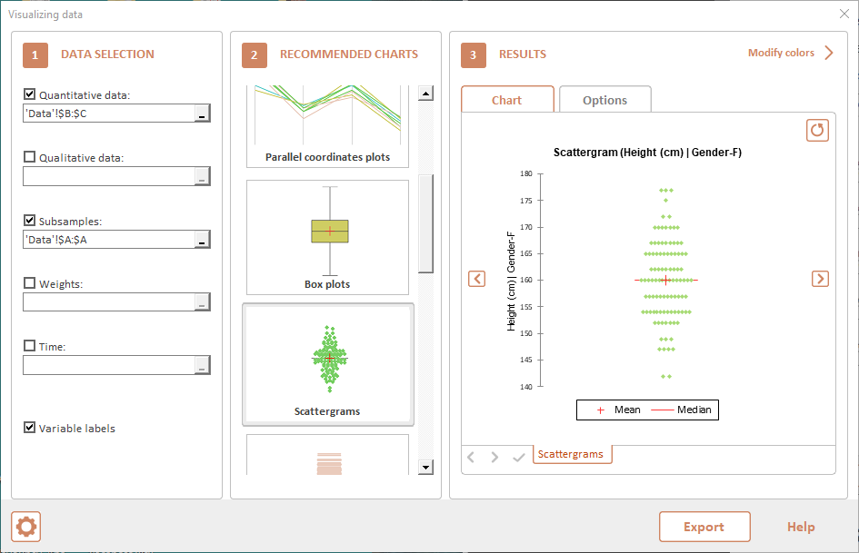
Select the scattergram to have an idea of the distribution.
-
Click on the Play button in the bottom right corner.
RESULTS
Four Scattergrams are displayed. Click on the right and left arrows to navigate through them.
-
Click on Options tab.
-
Check Group plots.
-
Click on Chart tab to update the results.
-
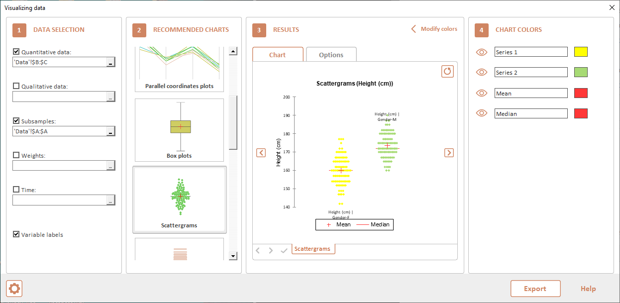
Two charts are now displayed:
-
First one for male and female height.
-
Second one for male and female weight.
-
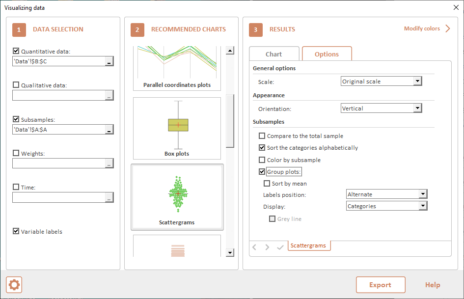
CHART COLORS
-
Click on Modify colors in the top right corner of RESULTS part.
-
CHART COLORS part appears.
-
Click on first eye icon to well detect which scattergram is for female.
-
Click on first green rectangle. A color picker pops up.
-
Choose Yellow color and click on OK. Displayed scattergram is updated.
-
Click on right arrow to go to the second chart.
-
Click on first green rectangle. A color picker pops up.
-
Choose Yellow color and click on OK. Displayed scattergram is updated.
EXPORT
Click on Export button to export scattergrams to a new worksheet.
Was this article useful?
- Yes
- No