Creating and customizing a plot
This tutorial is a general presentation on how plots can be created and customized in XLSTAT.There are two types of plots:
-
Those that are obtained from an analysis,
-
Those that can be created directly from the data.
In the first case, the plots can normally be obtained by activating the corresponding options in the Charts tab in the XLSTAT dialog boxes.In the case of the latter, the plots are accessible from the Visualizing data menu.
Setting up a plot directly from the visualization menu
If you are using Microsoft Excel 2007 or 2010, you select a plot from the menu bar.
 If you are using Microsoft Excel 2003 or a prior version you can use the tool bar Visualizing data that is available for the selection of the plots.
 The available plots in this menu are:
-
Univariate plots: Box plots, Scattergrams, Strip plots, Stem-and-leaf plots, Normal P-P plot, Normal Q-Q plots;
-
Histograms,
-
Scatter plots,
-
Parallel coordinates plots,
-
2D plots for contingency tables,
-
Error bars.
The set up of these plots begins when you have opened the corresponding dialog box.The first thing you have to do is to select the data to be plotted. This is done in the General tab. Depending on the plot you have selected, you may need to select one or several tables in a single or a number of fields.Here is an example for a scatter plot. You may select 2 or 3 quantitative variables, in the fields X, Y and Z.
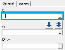
You need to click on the range selector to pick the data. The selection is done by choosing the data in the Excel spreadsheet with the cursor. You can select either columns or ranges. Note that it is possible to select non-adjacent data.You may need to fill in more information in the General tab; firstly when the selected data have labels, click the Variable labels option, they will be displayed on the chart as axis legend.
![]() If you want to group the samples by color depending on a category variable, tick the Groups option and select the variable in the Microsoft Excel spreadsheet.
If you want to group the samples by color depending on a category variable, tick the Groups option and select the variable in the Microsoft Excel spreadsheet.
![]() In a scatter plot, it is helpful to have the name of the observations displayed in the plot. To do that just tick the the Observation labels option and click on the range selector to select them.The Use cell format option allows you to define the font size and color of the labels in the spreadsheet on your plot which adds to the customization of your plot.
In a scatter plot, it is helpful to have the name of the observations displayed in the plot. To do that just tick the the Observation labels option and click on the range selector to select them.The Use cell format option allows you to define the font size and color of the labels in the spreadsheet on your plot which adds to the customization of your plot.
![]() The last setting to do in the General tab is to decide upon the location of the plots. You have three choices:
The last setting to do in the General tab is to decide upon the location of the plots. You have three choices:
-
At a specific place in a speadsheet. Select the option Range and then use the range selector to specify the location,
-
In a new sheet, option Sheet,
-
In a new workbook, option Workbook.
 Go to the Options tab to set more details about your plot.Don't hesitate to click on the Help button to get information about the different options. The help documentation will open in a pop-up window. In the plot that you have selected go to the Dialog box section, all the options are explained there.To proceed to the calculations click on the OK button.When you have clicked OK a summary appears. If you realise you need to modify your settings you can go back to the dialog box by clicking on the Back button.

Customization of a plot
When the plot is displayed you have the possibility to customize it furthermore.
-
Edit the text content. You can use Microsoft Excel tools to modify the font, font size, font style of text content such as the sample labels, axis labels, title and more.
-
Modify the labels of the samples/variables, and edit their font. Microsoft Excel cannot change the color of specific samples. However with the EasyLabels option of XLSTAT, you can do a full customization of the labels, treating them individually. It is also very easy to change from one type of label to another.
In the example below the labels were changed from the full name of the state to its abbreviation. At the same time the color of the label text was modified.
 Using the Reposition labels tool you can change the position of the labels.
-
Modify markers. You can use the default option of Microsoft Excel to modify the markers however all the markers should look the same per series.
With the XLSTAT EasyPoints tool, you can define markers shape, size and color. They can be different even within the same series. We use a coding for the shape of the label:
-
1 corresponds to a square,
-
2 to a diamond,
-
3 to a triangle,
-
4 to an x,
-
5 to a star (*),
-
6 to a point (.),
-
7 to a dash (-),
-
8 to a plus (+),
-
and 9 to a circle (o).
In the example bellow we have redefined the shape, size and color of the labels.

-
Add a trend line In a scatter plot you may wish to visualize a trend line. In order to do so you can use the option Add trend line available when you right click on the plot.

-
Modify the plot area: The background can also be modified.
-
Modify the aspect of the axes: When resizing a plot you may lose some of their properties such as the orthonormality. To retrieve this property you can use the option Orthonormal plot from XLSTAT. Also you may want to precisely define the size of the axis in your plot, use AxesZoomer.
-
Modify the appearance: It is possible to transform a plot using XLSTAT - we offers the following options: symmetry, translation, rotation.

-
Merge two or more charts The last option available in XLSTAT is Merge charts. It allows you to merge two or more similar charts.
The following video is a presentation of the various plots offered in XLSTAT as well as the different ways to customize a plot taking advantages of both Microsoft Excel and XLSTAT tools.
Was this article useful?
- Yes
- No