Scatter Plot Tutorial in Excel
This tutorial shows how to easily draw scatter plots in Excel using the XLSTAT software.
Dataset to Create a Scatter Plot
The data correspond to a small group of patients that have been on a specific diet. Their doctor has recorded their Weight before the treatment (kg), how much weight they've lost (kg), if they are satisfied or not with the diet effect, as well as their Age.
Our goal is here to visualize the results while keeping as much information as possible.
Setting Up a Scatter Plot
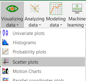
Select the Visualizing data / Scatter Plots command in the XLSTAT menu.
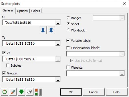
Once you have clicked on the button, the Scatter Plot dialog box appears.
In the General tab, select the data on the Excel sheet as follows:
X: Weight;
Y: Weight loss;
Z: Age;
Groups: Satisfied.
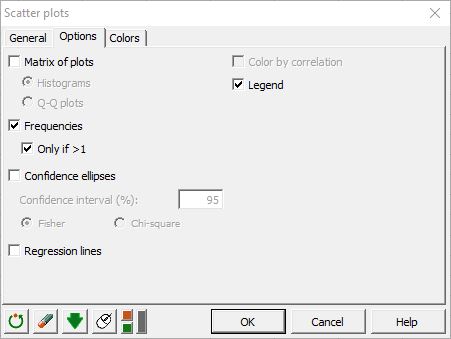
In the Options tab, activate the Frequencies and Only if >1 as we want to know if two or more points are superimposed if there is such a case. The Confidence Ellipses option can only be activated if the Z data option is deactivated in the General tab. This tutorial will help you in drawing scatter plots with confidence ellipses in XLSTAT.
Activate the Legend option to be able to identify points belonging to each of the two categories of the Groups column.
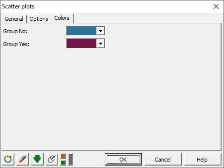
In the Colors tab, you can choose the color for each of the groups. First, enter the number of groups (here, we have yes/no so in total 2 groups). Then click on each group field below to choose its color. If you want to leave the default XLSTAT colors, do not check the group number option.
Interpreting a Scatter Plot
After you have clicked on the OK button, a chart is displayed on the sheet starting at H3 (this cell was selected in the Range option for outputs).
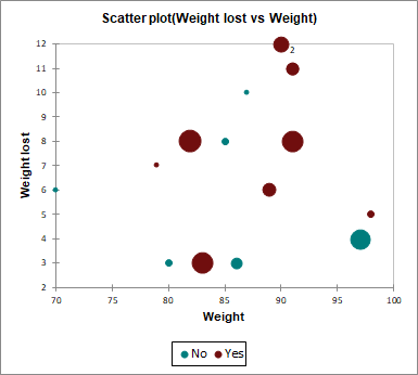
Bubble size is proportional to the Z variable (age in our case) and is thus a way to represent the third dimension of our two-dimensional plot. Here, for example, we see that satisfied people are relatively old.
Note 1: For one of the observations a label has been added. This tells us that two observations are superimposed.
Note 2: The observations labels haven't been used on the chart because the "Observations labels" option was not checked.
Was this article useful?
- Yes
- No