3D plot in Excel tutorial
This tutorial will show you how to draw a 3 dimensions - 3D - plot in Excel using the XLSTAT add-on statistical software.
Dataset for 3-D plotting
The data correspond to the outputs (rows points and columns points) of the correspondence analysis that has been performed in another tutorial. Using XLSTAT-3DPlot we will be able to visualize the correspondence map in 3 dimensions.
Setting up a 3-D graphic with XLSTAT-3DPlot
Before you activate XLSTAT-3DPlot, you can select the data you want to use for the 3D visualization. Note that the sum of the contributions on the 3 axes is included: it could be used to determine the size of the bubbles on the 3D map.

Once XLSTAT is activated, select the XLSTAT / Visualizing data / 3DPlot command, or click on the corresponding button of the Visualizing data toolbar. If you cannot see the button, you need to install XLSTAT-3DPlot. XLSTAT-3DPlot can be downloaded from the XLSTAT website.
Once you’ve clicked on the 3DPlot button, the XLSTAT-3DPlot device appears.
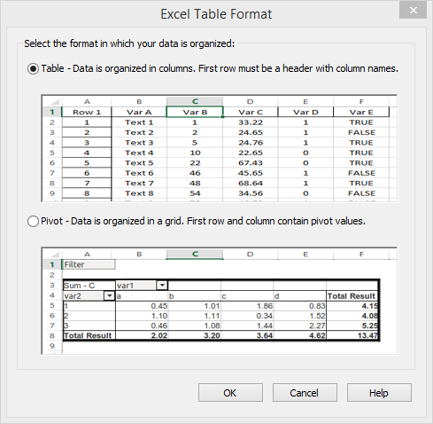
First, a dialog box appears asking you to select the input data format: a table with observations in rows and variables in columns or a pivot with data organized in a grid. Select the first option and click on OK.
XLSTAT-3DPlot automatically draws a plot out of the data you selected. Notice that XLSTAT chose to draw a scatter plot, but many other types of plots are available (check the Charts tab). Starting from this plot, you can manipulate several display options to reach the result that fits your needs.
We will manipulate axes, objects (points), annotations as well as lattices.
Axes configuration
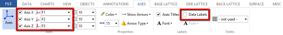
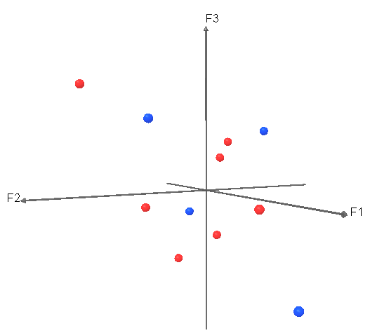
By default, XLSTAT-3DPlot chooses the three first columns in the dataset (Labels, F1 and F2 in our case) to build the X, Y and Z axes. We would like to switch to F1, F2 and F3 instead.
Click on the Axes tab. Make sure you select the F1, F2 and F3 data under the X, Y and Z axes, respectively. Uncheck the Data labels option as they are not very important in the context of correspondence analysis.
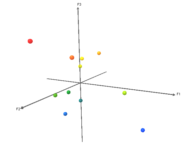
Resulting plot:
You may modify many other options related to the axes (arrow type, labels…).
Object manipulation
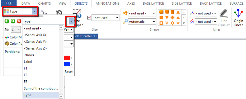
Coloration: It would be interesting to color points according to the data column “type”. Go to the Object tab. Under the Color option (top left), select the Type column.
Size: You may want to let the point size be proportional to the Sum of the contributions column data. Select this column in the corresponding slot in the objects tab. Notice that doing so makes the interpretation in perspective a bit more complicated. Thus we won't do it in this tutorial. Maybe you should rather use filtering to remove data points associated to a sum of the contributions lower than a certain threshold (see last paragraph in this tutorial).
Annotations
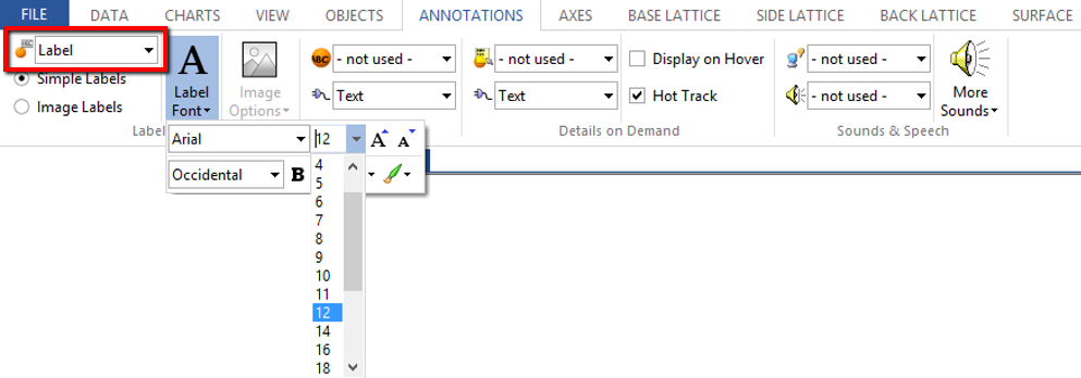
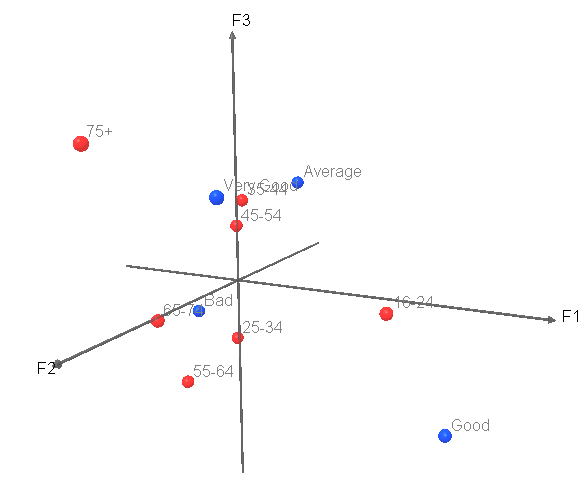
We will use the names stored in the Labels columns to tag the points. Go to the Annotations tab and select the Labels column under the Labels menu. Increase the font size for a better visibility.
Resulting plot:
Lattices
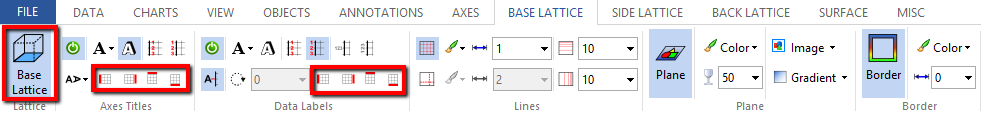
Lattices allow a more comfortable navigation in 3D. We will add a lattice at the base (axes F1/F2) and remove cumbersome annotations.
Resulting plot:

Final steps (filtering...)
Finally, many more options are available.
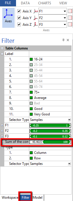
For example you may use filtering to only keep data points that have a sum of contributions higher than, say, 40%:
The mouse wheel allows you to move the image back and forth. Last, rotations can be done by clicking on the right button and by moving the mouse to the left and to the right (while keeping the button down).
Once you are satisfied with the result, you might want to copy the image (use the Ctrl C shortcut) and paste it in another application (Word or Powerpoint for example), or to save the visualization for future use or modification.
Was this article useful?
- Yes
- No