Parallel Coordinates Visualization in Excel tutorial
This tutorial shows how to draw parallel coordinates plots in Excel using XLSTAT software.
Dataset to create a Parallel Coordinates plot
The data are from [Fisher M. (1936). The Use of Multiple Measurements in Taxonomic Problems. Annals of Eugenics, 7, 179 -188] and correspond to 150 Iris flowers, described by four variables (sepal length, sepal width, petal length, petal width). In order to illustrate the use of qualitative variables in a parallel coordinate plot, the quantitative variable petal width was recoded into 2 classes.
Goal of this tutorial
Three different iris species are included in this study: Setosa, Versicolor and Virginica. The aim here is to quickly visualize whether there is a difference between the different species.
Setting up the Parallel Coordinates plot
Select the XLSTAT / Visualizing data / Parallel Coordinates Plot feature.

The Parallel Coordinates Plot dialog box appears.
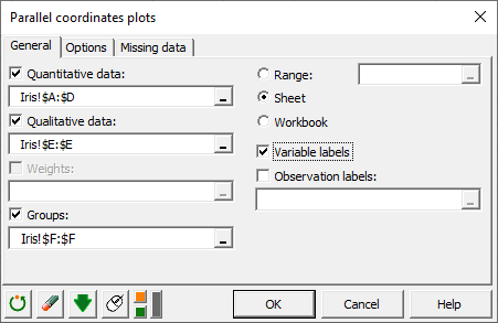
In the General tab, select columns A to D in the Quantitative Data field, column E in the Qualitative Data field and column F in the Groups field.
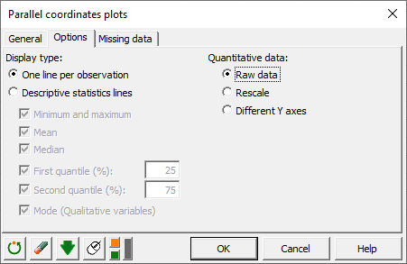
In the Options tab, we choose to display one line per observations and to use raw data
Interpreting a Parallel Coordinates plot
The computations begin once you have clicked on OK. The chart will then be displayed.
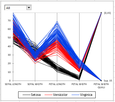
This chart shows that the Setosa specie in black has significantly shorter petals than the two others. We can also see that the species Virginica has the widest petals.
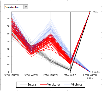
To isolate certain groups, we can choose to highlight them by making the others transparent. For this, simply click on the drop-down menu at the top left of the graph. An example for the Versicolor group is given below.
Was this article useful?
- Yes
- No