Bar chart race tutorial in Excel
This tutorial explains how to generate and display a bar chart race in Excel using the XLSTAT software.
What is a bar chart race?
To visualize values of a variable for different groups (categories), we often user bar charts. The height of each bar represents the value of the measured variable for a given group. However, if the variable is measured at different times, the classical bar chart cannot be used to show the evolution over time. This is where the bar chart race comes in handy. It allows to visualize the evolution of a variable over time on a single dynamic chart.
Dataset for setting up a Bar chart race
The dataset represents the Grand Slam victories par tennis player and per year since 1970. The Number of Grand Slam victories variable gives the total number of Grand Slam titles the player has won. The Date variable gives the date of the tournament and the Name variable gives the winning player. Due to a lack of data, some players who won Grand Slam tournaments before 1970 were not included. For example, Margaret Court, who holds the record for the number of Grand Slam victories (24 titles), does not appear here.
The goal of this tutorial is to show the evolution of Grand Slam winners through a dynamic chart over time for the given period (1970-2019).
Building a bar chart race in XLSTAT
Select the XLSTAT/ Visualizing data / Bar chart race feature as shown below:
 The Bar chart race dialog box appears.
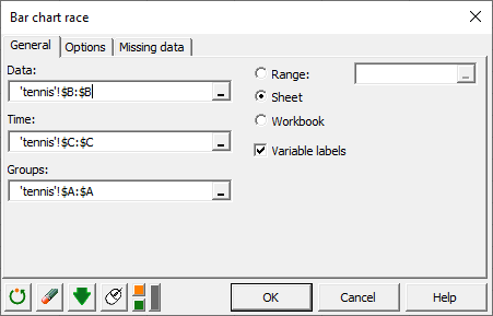 In the Data field, select the B column which corresponds to the variable Number of Grand Slam victories. Then select the C column in the Time field and the A column, containing the names of players, in the Groups field.
 In the Options tab, we choose to display the bars in a way that the smallest bar is at the bottom of the graph at the end of the animation. We also choose to color the bars using a color scale. The original data represents the total number of Grand Slam titles held by player, so we choose to display the raw data and not the cumulated data.
Once you click the OK button, the calculations start and the results are displayed.
Configuring the animation for a Bar chart race in XLSTAT

The above Bar chart race was paused in 1996 and shows the results per player for this year.
The scrollbar at the bottom of the chart can be used to change the value of the Time variable and thus display the positions of the bars at a specific date.
At the top left of the chart four buttons are available. You can move forward or backward over time using the play and back buttons, and stop the animation using the pause button. The fourth button on the right allows you to change the speed of the animation (1 very slow - 10 very fast) over time.
Interpreting a Bar chart race in XLSTAT
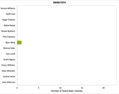 This animation shows the evolution of the most titled players over time. For example, we see the domination of Björn Borg during the 1970s. Between the mid-1980s and the mid-1990s, Steffi Graf emerged. Finally, at the beginning of the 2000s Serena Williams and Roger Federer appear as the tennis players with most titles with these two being often neck and neck. From 2015, Serena Williams takes the lead of the classification.
Was this article useful?
- Yes
- No