Semantic Differential Chart in Excel tutorial
This tutorial helps you draw and interpret a Semantic Differential Chart in Excel using the XLSTAT statistical software.
Semantic Differential Chart
The psychologist Charles E. Osgood has developed the visualization method Semantic differential in order to plot the differences between individuals' connotations for a given word. When applying the method, Osgood asked survey participants to describe a word on a series of scales ranging from one extreme to the other (for example favorable/unfavorable). When patterns were significantly different form one individual to the other or from one group of individuals to the other, Osgood could then interpret the Semantic Differential as a mapping of the psychological or even behavioral distance between the individuals or groups.
This method can also be used for a variety of applications:
-
Analysis of the experts perceptions for a product (for example a yogurt) described by a series of criteria (for example, acidity, saltiness, sweetness, softness) on similar scales (either from one extreme to the other, or on a similar liking scale for each criterion). A Semantic differential chart will allow to quickly see which experts agree, and if significantly different patterns are obtained.
-
Survey analysis after a customer satisfaction survey.
-
Profile analysis of candidates during a recruitment session.
Dataset for creating a semantic differential chart
The data used in this tutorial correspond to a survey where five experts have been asked to rate a product using six descriptors. The results are displayed in a table (see below).

Goal of this semantic differential chart
Our goal is to quickly visualize if there are some differences between the judges.
Setting up a semantic differential chart
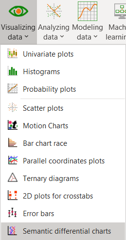
To activate the Semantic Differential Chart dialog box, start XLSTAT, then select the XLSTAT / Sensory data analysis / Semantic Differential Charts command, or Visualizing data / Semantic Differential Charts.
Once you have clicked on the button, the dialog box appears.
Select the data on the Excel sheet. The objects correspond to columns C to G, and the descriptors to the columns A and B.
Select the labels of the experts, and include the header, even if is blank, as the Variables labels option is activated.

Interpreting a semantic differential chart
After you have clicked on the OK button, the semantic differential chart is displayed.

We can see here that most of the experts gave pretty different opinions. Only the experts 4 and 5 gave similar ratings.
Was this article useful?
- Yes
- No