Run 4 or 5-parameter logistic regression in Excel
This tutorial will show you how to set up and interpret a 4 or 5-parameter logistic regression in Excel using the XLSTAT statistical software.
Four Five-parameter logistic regression
The four or five-parameter parallel lines logistic regression allows comparing the regression lines of two samples (typically a standard sample, and a sample that is currently being studied). Of course, this tool can also be used to fit a four or five-parameter logistic curve to a unique sample.
If no group or a single sample was selected, the results are shown for the model and for this sample. If several sub-samples were defined (see sub-samples option in the dialog), the model is first adjusted to the standard sample, then each sub-sample is compared to the standard sample.
Dataset for running a four-parameter logistic regression
The example treated here is an medical case where a molecule is being injected at a given concentration, and where the concentration of type of cells in the blood is being measured.
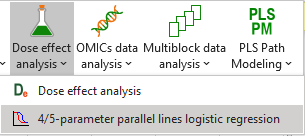
Setting up a four-parameter logistic regression
To activate the parameter logistic regression dialog box, start XLSTAT, then select the Dose / Four parameters logistic regression.
When you click on the button, a dialog box appears. Select the data on the Excel sheet.
The Dependent variable is here the concentration of cells, and the Explanatory variable is the Log of the concentration of the injected molecule.
As we selected the column titles of all variables, we have selected the option Variable labels.

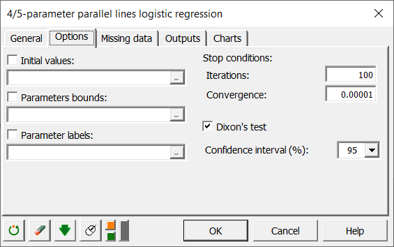
In the Options tab, we uncheck the Dixon's test because we do not think that there are "Outliers" in our data.
The computations begin once you have clicked on the OK button. The results are displayed on a new Excel sheet as requested in the first dialog box.
Interpreting the results of a four-parameter logistic regression
The first table gives the descriptive statistics of the selected data.
Then the results for the standard sample are displayed.
We see that the goodness of fit statistics are high (see table below).

The fitted parameters are displayed in the table below.

After the tables that contains the predictions and residuals for the standard sample, the regression curve is displayed.

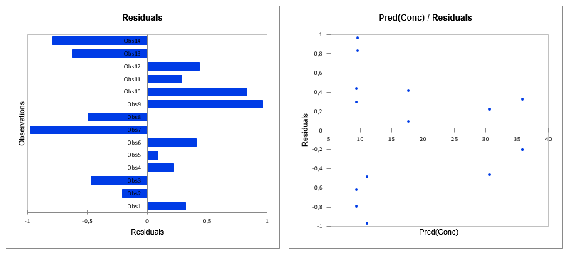
Graphs for residual analysis are also available.
 Once these results for the standard sample have been displayed, the results regarding the comparisons of the curves are displayed.
Have a look at the table displaying the results of the Fisher F-test that is performed to check if the two curves are parallel.
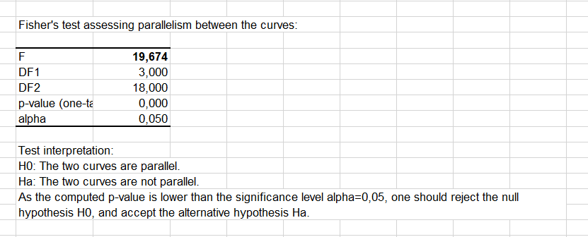 We see here that the two curves cannot be considered as being parallel as the p-value is below 5%. This indicates that there is a significant difference between the samples.
However we see that the goodness of fit statistics are high (see table below). This means that the difference between the samples is well explained by the slope parameters c1 and c2.

The fitted parameters are displayed in the table below.

After the tables that contains the predictions and residuals for both samples, the two regression curves are displayed, enabling a visual comparison of the samples.

We can see that the strongest differences between the samples are in the [1.3, 2] for the log of the concentration.
Was this article useful?
- Yes
- No