Time weighted control chart in Excel tutorial
This tutorial shows how to compute and interpret a time weighted control chart on quantitative data in Excel using XLSTAT software.
Dataset for the analysis of a time weighted chart
The data are from [Ryan Th. P. (2000), Statistical Methods for Quality Improvement, Second Edition, John Wiley & Sons, New York]. They correspond to simulated data of 20 inspections each having 4 measurements of a production process.
Goal of this tutorial
The time weighted charts tool offers you the following chart types:
- CUSUM or CUSUM individual
- UWMA or UWMA individual
- EWMA or EWMA individual
A CUSUM, UWMA or EWMA chart is useful to follow the mean of a production process. Mean shifts are easily visible in the diagrams.
UWMA and EWMA charts
These charts are not directly based on the raw data. They are based on the smoothed data.
In the case of UWMA charts, the data is smoothed using a uniform weighting in a moving window. Then the chart is analyzed like Shewhart charts.
In the case of EWMA charts, the data is smoothed using an exponential weighting. Then the chart is analyzed like Shewhart charts.
CUSUM charts
These charts are not directly based on the raw data. They are based on the normalized data.
These charts help to detect mean shifts of a user defined granularity. The granularity is defined by the design parameter k. K is the half of the mean shift to be detected. Normally to detect 1 sigma shifts, k is set to 0.5.
This tutorial explains the ability of the CUSUM charts to detect quicker than a comparable X-bar chart a small mean shift. A process will be simulated that has a mean of 0 and a standard deviation of 1 for the first 12 inspections. Starting with the 13th inspection, the process mean is now 0.5. The standard deviation is unchanged 1. Therefore the first 12 inspections are simulated with a normal law N(0, 1) and the 8 following inspections by the normal law N(0.5, 1). It will be shown using the X-bar chart and the CUSUM chart, how fast this mean shift will be detected.
During this tutorial a one-sided CUSUM chart and a X-bar chart will be used.
Setting up the dialog box for generating a time weighted chart
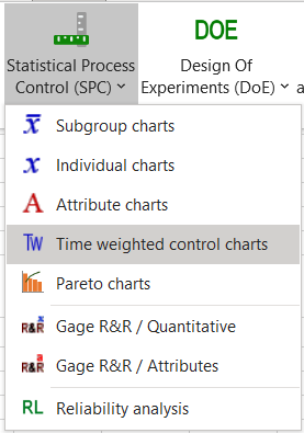
After launching XLSTAT, click the Statistical Process Control button on the ribbon and select time weighted charts.
The dialog box pops up.
 In the General tab, select the chart type, choose the CUSUM chart, and the data. Activate the option Target and enter the mean value of the process 0.
 In the Options tab, we activate the option Sigma and enter the historical value for sigma: 1.
 In the Options/Design tab, choose the Scheme one sided (LCL/UCL) to obtain the cumulated lower and upper sum. Enter 4 for h to detect a mean shift, when the cumulated sum has a value of 4 or bigger. Enter 0.5 for k to have a model that detects mean shifts starting at 0.5 sigma or more.
Then click on the OK button, the computations start.
Interpret the results of the time weighted chart
The first results are the estimated mean and standard deviation values. These values are the same than the historical values entered: 0 and 1.
The following tables with their corresponding chart represent the CUSUM control chart including the different control limits and central lines. In the first table the control limits of the NP control chart are mentioned. They are chosen using the parameter h = 4. LCL equals -2 and UCL equals 2.
Then the data of the CUSUM control chart starting with the group size, the normalized values (z), the lower CUSUM, and the upper CUSUM are displayed. After this the central line (CL), the lower (LCL) and the upper (UCL) control limit and the lower and upper zone limits for the A and B area are displayed for each group.

 We see that the upper CUSUM for inspection 13 has a value of 2.115 and is outside the control limit of 2. This is the detection of the mean shift.
The normalized values z in the CUSUM details represent a X-bar chart in a condensed format. If a value is bigger than 3, it is equal to a value in the X-bar chart bigger than 3 sigma, the usual upper control limit for a X-bar chart. In this case here all normalized values z are smaller than 3.
During this tutorial we could see that the CUSUM chart is more efficient to detect small mean shifts than an X-bar chart.
Was this article useful?
- Yes
- No