Kontrolldiagramme in Excel erstellen - Anleitung
This tutorial shows how to compute and interpret an individual control chart on quantitative data in Excel using XLSTAT software.
Dataset to create individual charts
The data are from [Pyzdek Th. (2003); The Six Sigma Handbook, McGraw Hill, New York] and correspond to 25 inspections each having 5 measurements of a production process. To better compare the results with the tutorial on subgroup charts, the same data set was used. In this case only every 1st measurement was considered.
Control charts and individual charts
Control charts are an efficient method to decide if a process is statistically under control or not. There is a variety of different control charts that can be used for different aims.
The individual charts tool lets you use the following chart types alone or in combination:
- X Individual: It is useful to follow the moving mean of a production process. Mean shifts are easily visible in the diagrams.
- MR moving range: It is useful to analyze the variability of the production. Large differences in production, caused using different production lines, will be easily visible.
Note 1: If you want to investigate smaller mean shifts, then you can also use CUSUM individual charts which are often preferred in comparison to the individual control charts, because they can detect smaller mean shifts.
Note 2: If you have more than one measurement for each point in time, then please use the control charts for subgroups.
Note 3: If you have measurements in qualitative values (for instance ok, not ok, conform not conform), then use the control charts for attributes.
During this tutorial an X chart along with an MR one will be used.
Setting up the dialog box for generating an individual control chart
After launching XLSTAT, click the Statistical Process Control button on the ribbon and select individual charts.
 The dialog box pops up.

In the General tab, select the chart type, choose the combination X-MR individual/Moving Range chart, and the data.

In the Options/Estimation tab, you can choose the option Average Moving Range and a MR Lengths of 2.
Then click on the OK button, the computations start.
Interpret the results of the individual control chart
The first results are the estimated mean and standard deviation values.
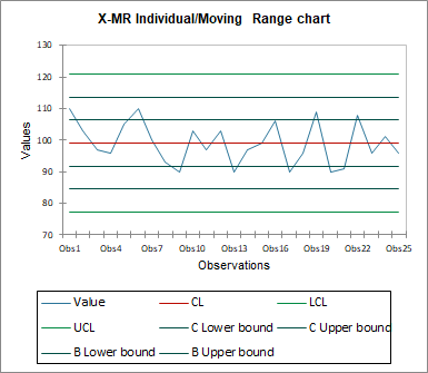
The following tables with their corresponding chart represent the X control chart including the different control limits and central lines.
- In the first table the control limits of the X control chart are mentioned and enable us to plot the X control chart:. 120.753 for the UCL maximum value
- 99.040 for the goal value
- 77.327 for the minimum LCL value
A fundamental difference between the individual and subgroup charts becomes visible: Subgroup charts have a narrower range of control limits caused by the average calculated. This may lead to the conclusion to look for special causes that are not really present. Individual charts tend to have wider control limits and may need more process tuning work.
 Then the data of the X control chart starts with the group mean, group min and group max. After this the central line (CL), the lower (LCL) and the upper (UCL) control limit and the lower and upper zone limits for the A and B area are displayed for each group. We can see that the data are well between the limits.
 Like the X chart the data of the MR chart is always inside the control limits and no special causes are present.
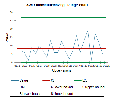 Both control charts let us conclude that the process is “statistically under control”.
Further it is interesting to know if the data follows a normal distribution, in which case the common rules for control charts and process capabilities could be applied. In the next section the results of 4 different normality tests and a Q-Q plot are displayed. By looking at the results of the Jarque-Bera test, we can see that the p-value is greater than 5%, hence we cannot reject the null hypothesis. The three other tests provide us with the same result and moreover on n the Q-Q plot we see that the data are close to the first bisector line. We suppose that the data is normally distributed.
 At last, the run chart is displayed. It contains all the individual measurements depending on time. We cannot detect any trend and the values are well within the control limits.

War dieser Artikel nützlich?
- Ja
- Nein