Spearman correlation coefficient in Excel tutorial
This tutorial will help you run and interpret a Spearman non parametric correlation test on quantitative variables in Excel using XLSTAT.
Not sure this is the statistical test you are looking for? Check out this guide.
Dataset to run a Spearman correlation coefficient test
The data used in this example correspond to a survey where a given brand/type of potato chips has been evaluated by 100 consumers. Each consumer gave a rating on 1 to 5 scale for four attributes (Saltiness, Sweetness, Acidity, Crunchiness) - 1 means "little", and 5 "a lot" -, and then gave an overall liking score on a 1-10 likert scale. Our goal is to check how the attributes are correlated with the liking score.
Correlations are computed in many of the XLSTAT features. However two functions are dedicated to that: the Describing data / Similarity/Dissimilarity matrices feature, and the Correlation/Association tests / Correlation tests feature. In this tutorial, we use the Correlation/Association tests / Correlation tests tool.
Setting up a Spearman correlation coefficient test
After opening XLSTAT, select the Correlation/Association tests / Correlation tests function.

Once you've clicked on the button, the dialog box appears. We select the liking scores and the four attributes in the Observations/Variables box. As the first row of the table corresponds to headers, we leave the Variable labels option checked.
Because the data are not continuous but ordinal, we choose to use the Spearman correlation coefficient instead of the Pearson correlation coefficient which is the usual one for continuous data.

In the Outputs tab, we choose the results we want to display using the checkbox.

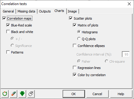
In the Charts tab, we select the correlations maps we want to display.
The computations begin once you have clicked on OK. The results will then be displayed.
Interpreting the results of a Spearman correlation coefficient test
The first results are the descriptive statistics for the liking data and the attributes. The correlations matrix is then displayed.

Correlation coefficients vary between -1 and 1. Negative values indicate negative correlation, and positive values indicate positive correlations. Values close to zero reflect the absence of correlation.
The correlations between the liking scores and the attributes are mostly low. The correlation between the liking scores and the Crunchiness is higher than average with 0.466. This suggests that the only criterion for which we have "the more, the better" is the crunchiness. For the other criteria it is likely that there is an intermediate optimal level, above which the consumers will show their insatisfaction.
Coefficients values in bold are significant at a 0.05 significance level. In other words, the risk of rejecting the null hypothesis (coefficient =0) while this is true is less than 5%. This is confirmed by the table of the p-values below (p-values < 0.0001).

XLSTAT is among the few software that generates correlation maps. Correlation maps allow to visually identify patterns in correlations. While this has more meaning when there are many dimensions, we take advantage of this example to show how the maps can be used.
The first correlation map uses a blue-red (cold-hot) scale to display the correlations. The blue color corresponds to a correlation close to -1 and the red color corresponds to a correlation close to 1. Green corresponds to a correlation close to 0.

The second correlation map uses black and white to respectively identify positive and negative correlations. The diagonal is displayed in grey color.

The third correlation map uses patterns to identify both the sign and the intensity of the correlations:
-
lines that go from the bottom left to the top right correspond to positive correlations, and vice versa;
-
the tighter the lines, the closer the correlation to 0.

Note: if you only want to compute the correlation coefficient between two samples, you can use directly in the Excel sheet the XLSTAT XLSTAT_Spearman function. Example: on the "Data" sheet, type in the G2 cell, "=XLSTAT_Spearman(A2:A101,B2:B101)".
Was this article useful?
- Yes
- No