CHAID classification tree in Excel tutorial
This tutorial will help you set up and interpret a CHAID classification tree in Excel with the XLSTAT software.
Dataset for creating a CHAID classification tree
The data are from [Fisher M. (1936). The Use of Multiple Measurements in Taxonomic Problems. Annals of Eugenics, 7, 179 -188] and correspond to 150 Iris flowers, described by four variables (sepal length, sepal width, petal length, petal width) and their species. Three different species have been included in this study: setosa, versicolor and virginica.


Iris setosa, versicolor and virginica.
Goal of this CHAID classification tree
Our goal is to test if the four descriptive variables allow to efficiently predict to which species a flower corresponds, and in this case, to identify rules that would help to classify the flowers on the basis of the four variables.
Setting up the dialog box to generate a CHAID classification tree
After opening XLSTAT, select the XLSTAT / Machine Learning / Classification and regression trees command.

Select the qualitative dependent variable. In our case, this is the column "Species". The quantitative Explanatory variables are the four descriptive variables. We choose to use the CHAID algorithm to build the tree. Select the Variable labels to consider the variables names provided in the first row of the data set.

In the Options tab, we set the maximum tree depth to 3 to avoid obtaining a too complex tree. Several technical options allow to better control the way the tree is built.


In Charts tab we first select the Bar charts option to display the distribution of the species at each node.

The computations begin once you have clicked on OK. The results will then be displayed.
Interpreting the results of a CHAID classification tree
The summary statistics for all variables and the correlation matrix are first displayed followed by the confusion matrix which summarizes the reclassification of the observations. The latter one allows to quickly see the % of well-classified observations, which is the ratio of the number of well-classified observations over the total number of observations. Here, it is equal to 98,67%.

We can note that here only 2 observations are misclassified.
The next result displayed is the node frequencies, that is, the distribution of species at each node of the tree and the related probabilities.

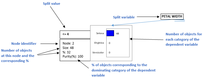
Next, the information on the tree structure is provided. For each node, this represents the number of objects at each node, the corresponding %, the test statistic, the p-value for the splitting, the degrees of freedom, the purity that indicates what is the % of objects that belong to the dominating category of the dependent variable at this node, the parent and child nodes, the split variable and the value(s) or intervals of the latter, and the class predicted by the node.

The following table contains the rules built by the algorithm written in natural language. At each node, the rule corresponding to the predicted class is displayed. The % of observation in the node gives the % that corresponds to the predicted category at a specific node level.

We can see that "If PETAL WIDTH <= 4 then SPECIES = Setosa in 32% of cases" this rule allow us to get node 2 and is checked for 45 flowers (32% of the data set) with a node purity of 100% as shown in the Tree structure table. So we have all the observations of this node which are correctly classified.
The next result is a part of the classification tree.

This diagram allows to visualize the successive steps in which the CHAID algorithm identifies the variables that allow to best split the categories of the dependent variable. The information available at each node is explained below.
The algorithm stops when no additional rule can be found, or when one of the limits set by the user are reached (number of objects at a parent or child node, maximum tree depth, threshold p-value for splitting).
XLSTAT offers a second possibility to visualize the classification trees. Instead of using bar charts, it uses pie charts. The latter is easier to read when they are many nodes and many categories for the dependent variable. The inner circle of the pie corresponds to the relative frequencies of the categories to which the objects contained in the node correspond. The outer ring shows the distribution of the categories at the parent node.

The rules that correspond to the leaves of the tree (the terminal nodes) allow to compute predictions for each observation, with a probability that depends on the distribution of the categories at the leaf level. These results are displayed in the "Results by object" table.

Was this article useful?
- Yes
- No